Project Overview
The goal of this project is to revitalize the American Institute of Architects United Kingdom website's user experience, ensuring it is intuitive, visually appealing, and can effectively communicate the AIA UK's value to its members and to the broader community.
Enhancing the EXPERIENCE while ALSO targeting GROWTH
I acted as the sole designer, product manager, project planner and implementation specialist for this project as Founder of Polaris Design Studio.
Challenge
The AIA UK website serves as a pivotal platform for architects and design professionals across the UK. However, the current site presents several challenges including:
Navigation Complexity
Outdated Visual Design
Content Accessibility
Goal
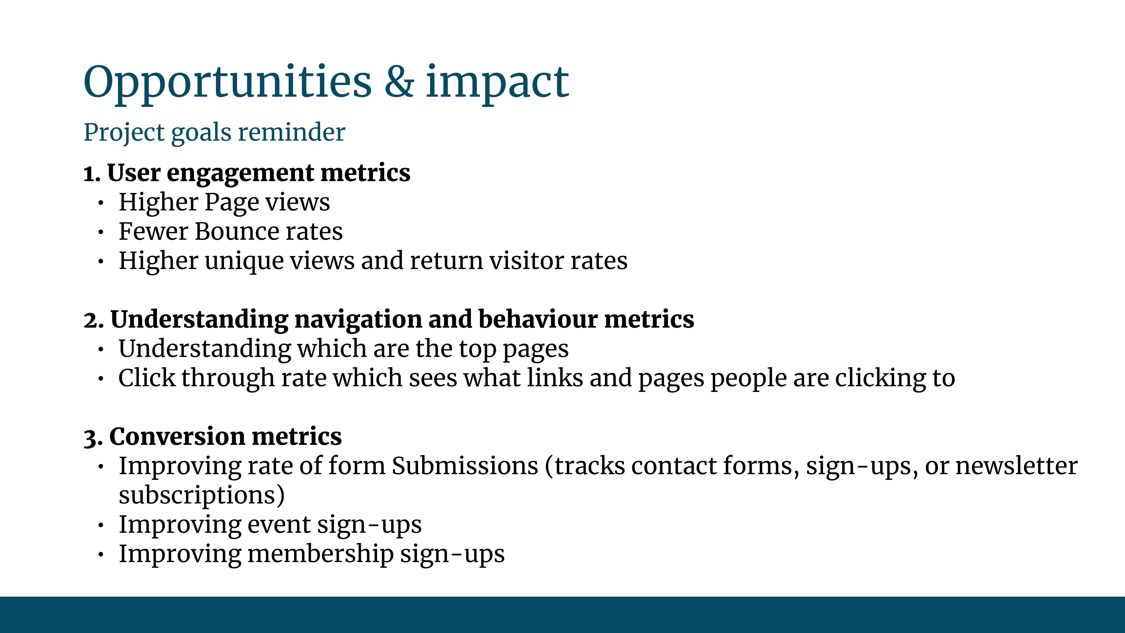
Create a new responsive website that focuses on showcasing the value of the AIA UK in order to help grow the organization and encourage members to become more involved.
Design Process
Phase 1
Understand stakeholder requirements & constraints
Goals
Constraints
Current Website Audit
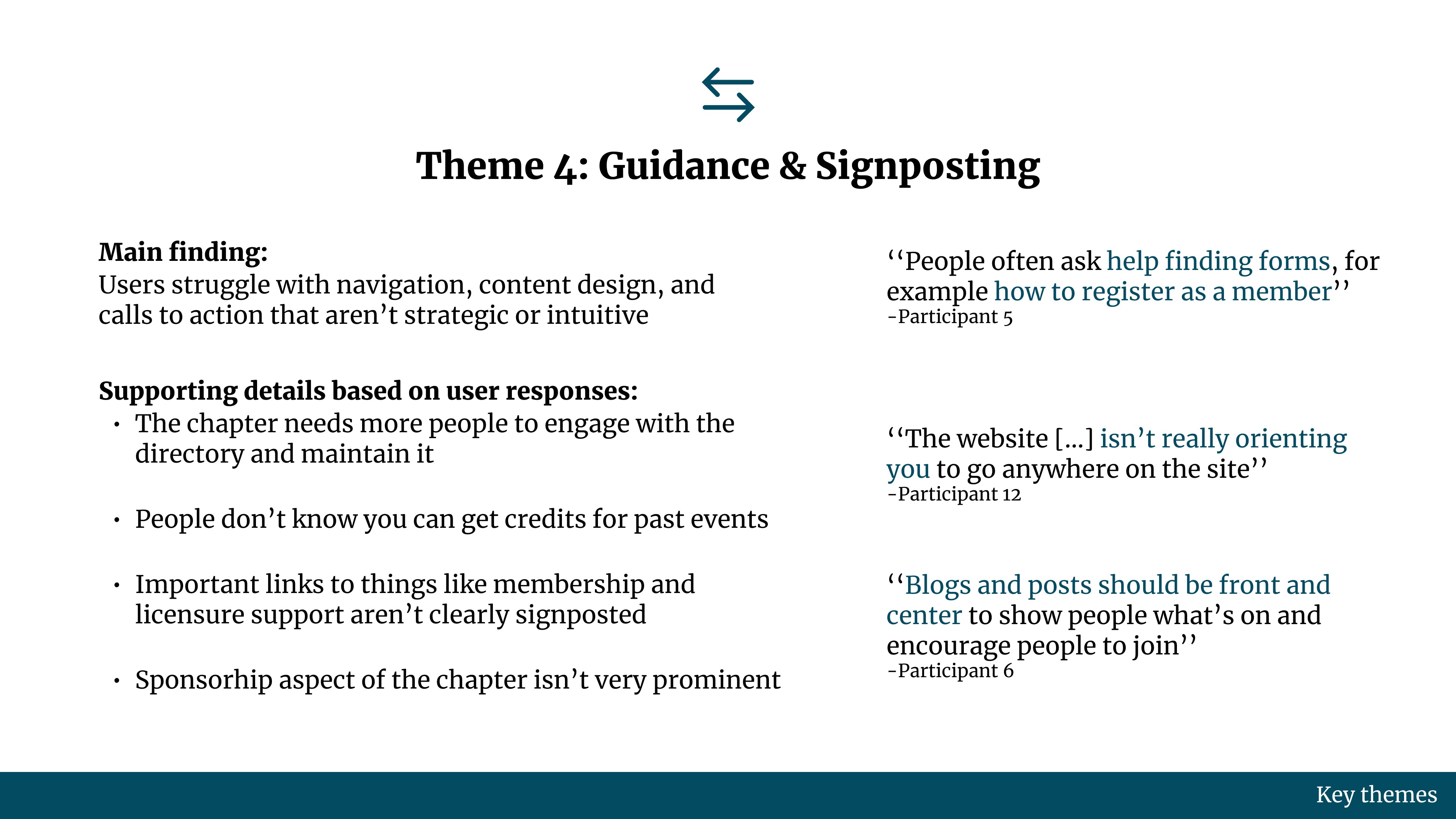
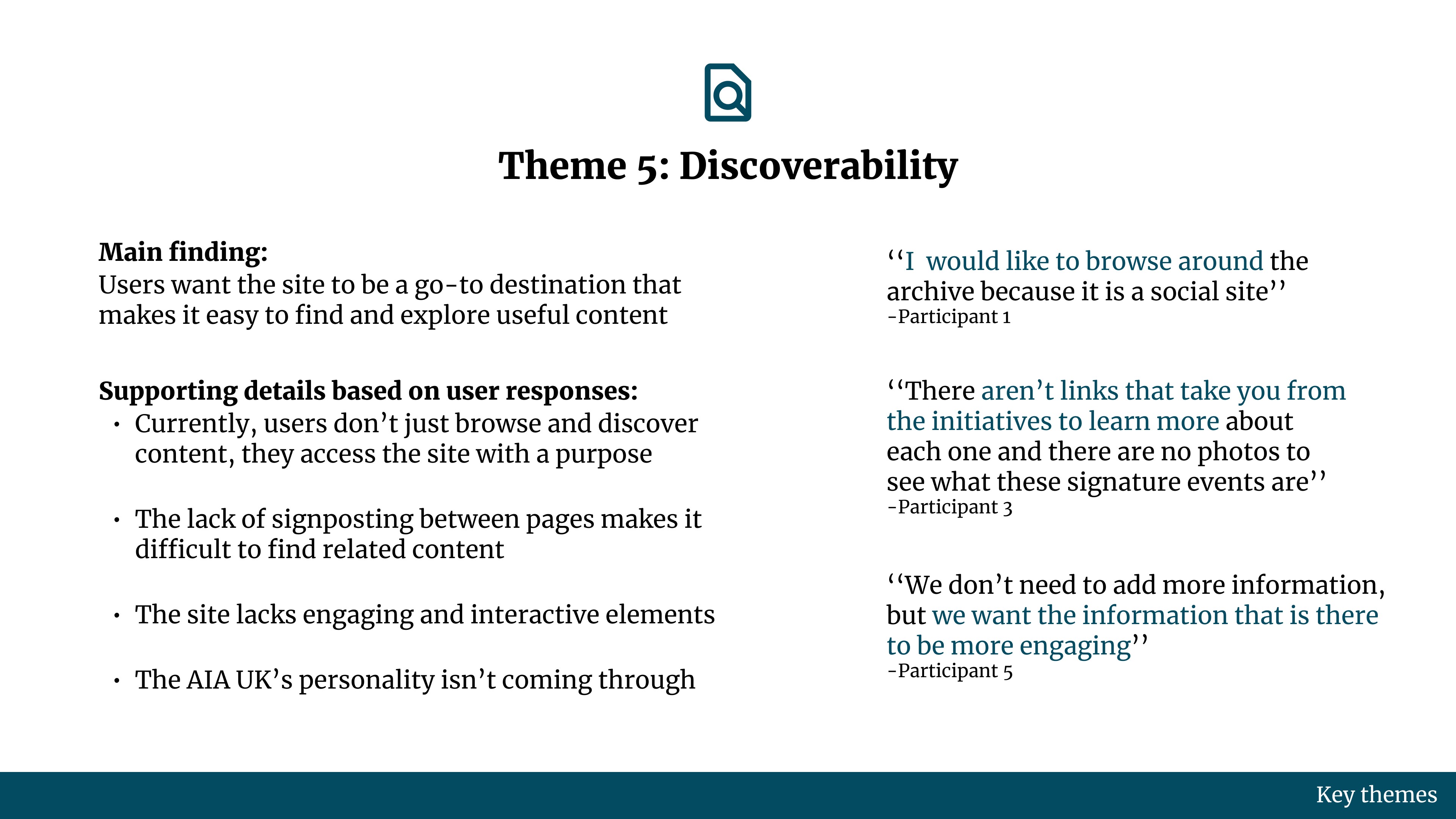
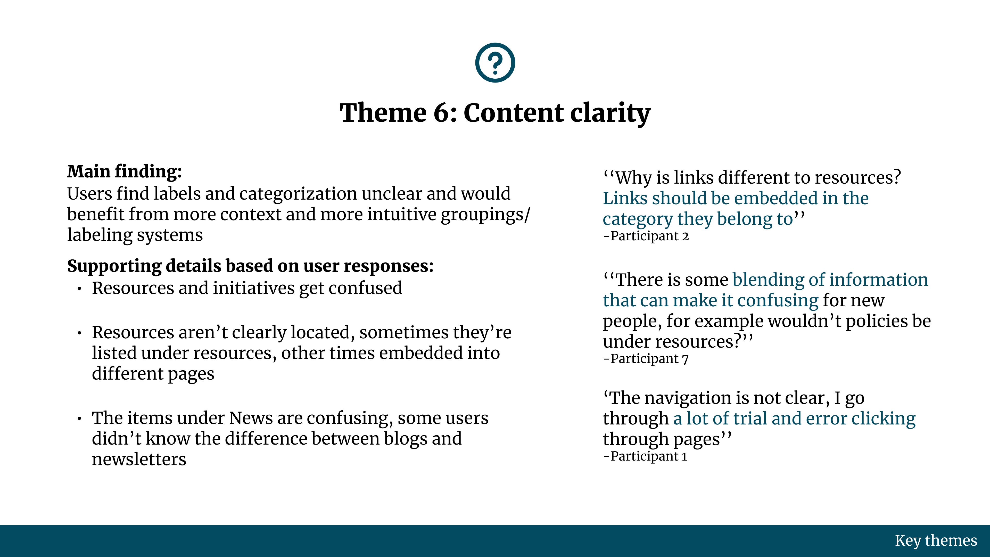
The next step was to perform an audit of the live website and identify any challenges with the design that could be hindering the AIA UK's goals of membership growth and increased participation with their activities.
Below are the main areas I was assessing during the audit. The audit results, along with user research insights, were presented to leadership in order to get stakeholder buy in for the next stage of the project which would involve the actual redesign work.
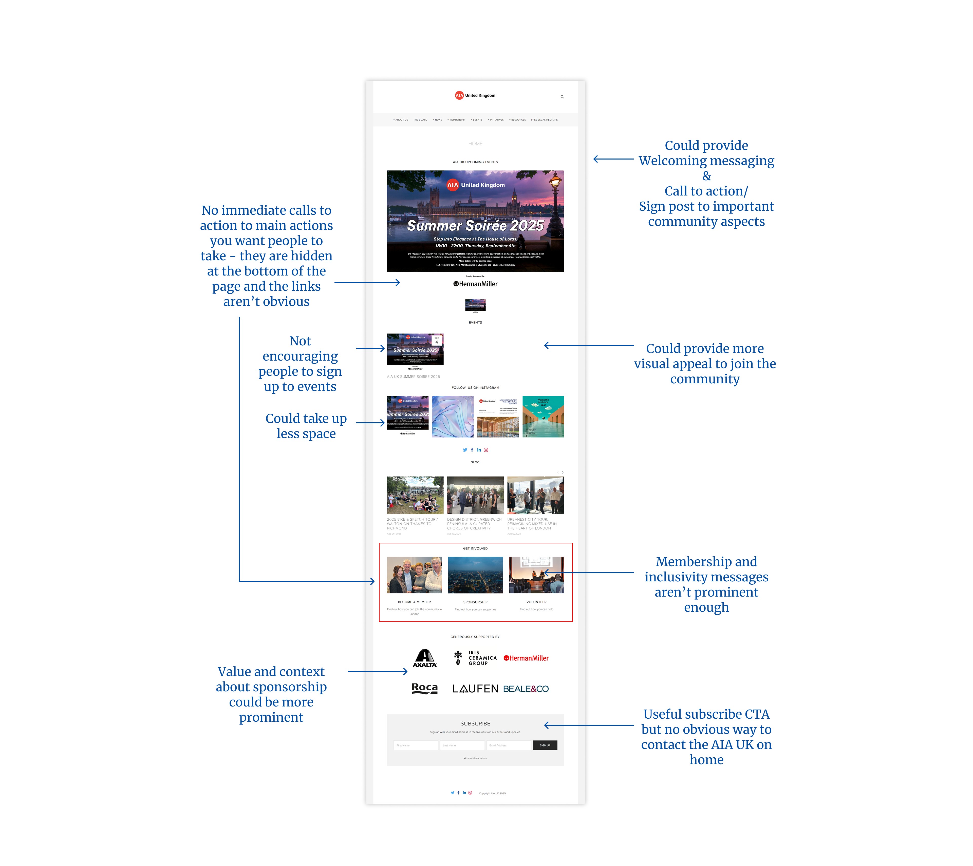
Content Clarity (tone, labeling, messaging)
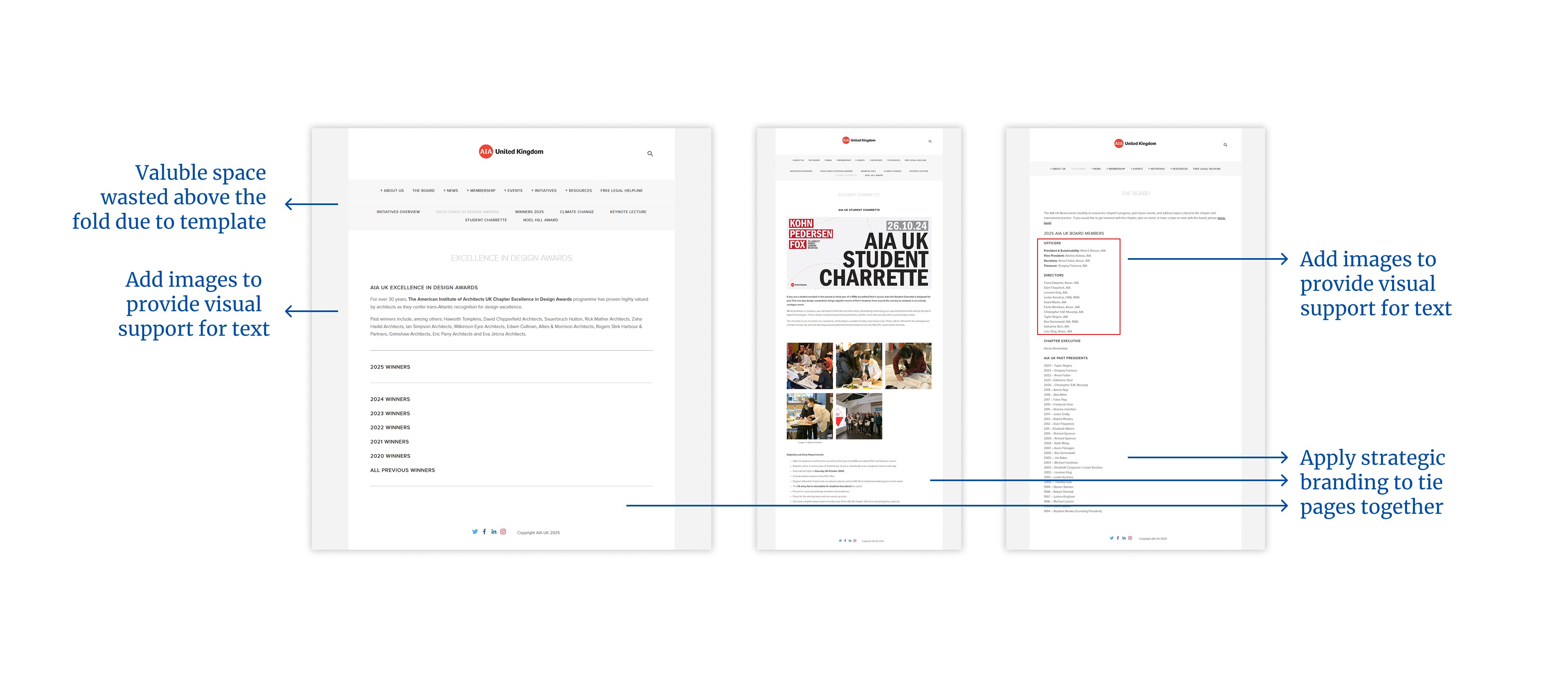
Visual Design & Branding
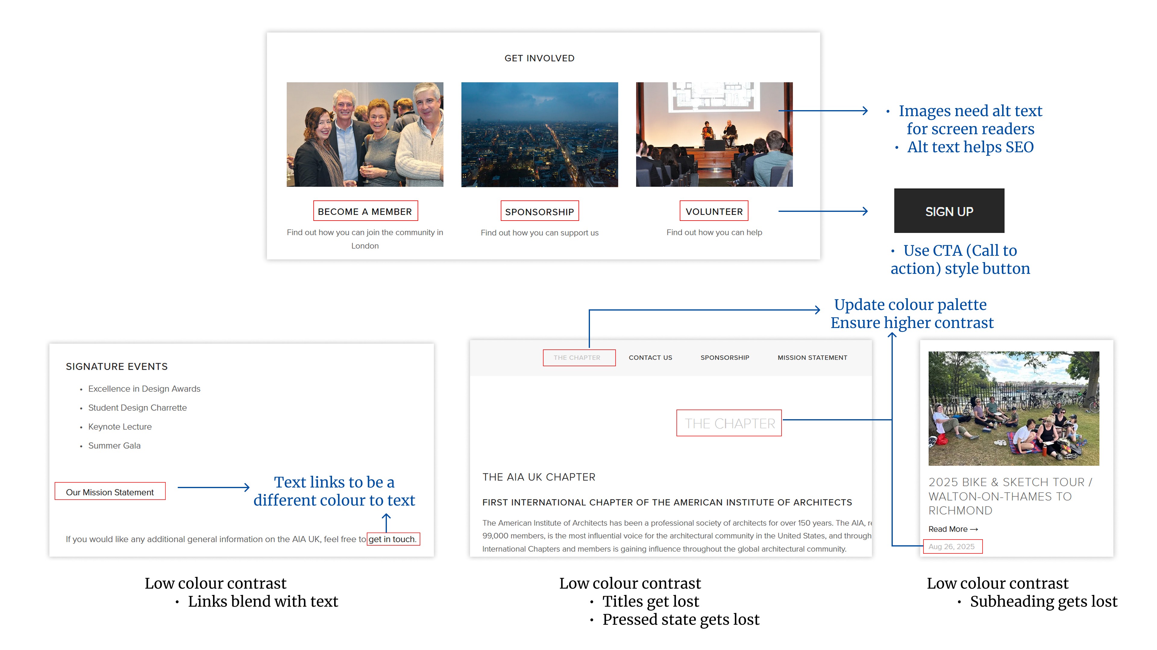
Accessibility & inclusivity (readable, perceivable)
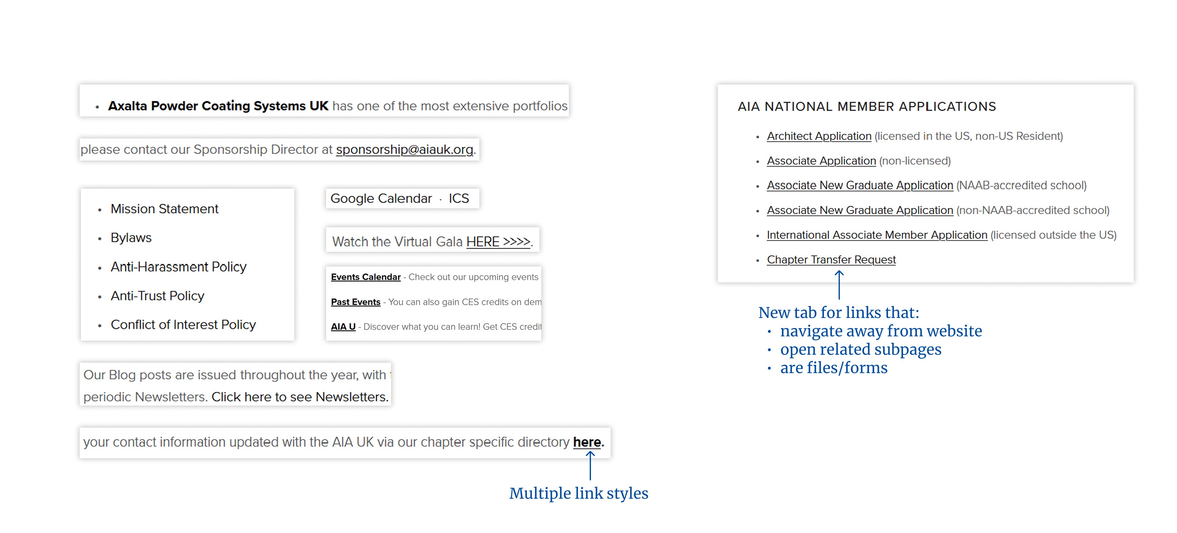
Usability & interaction patterns
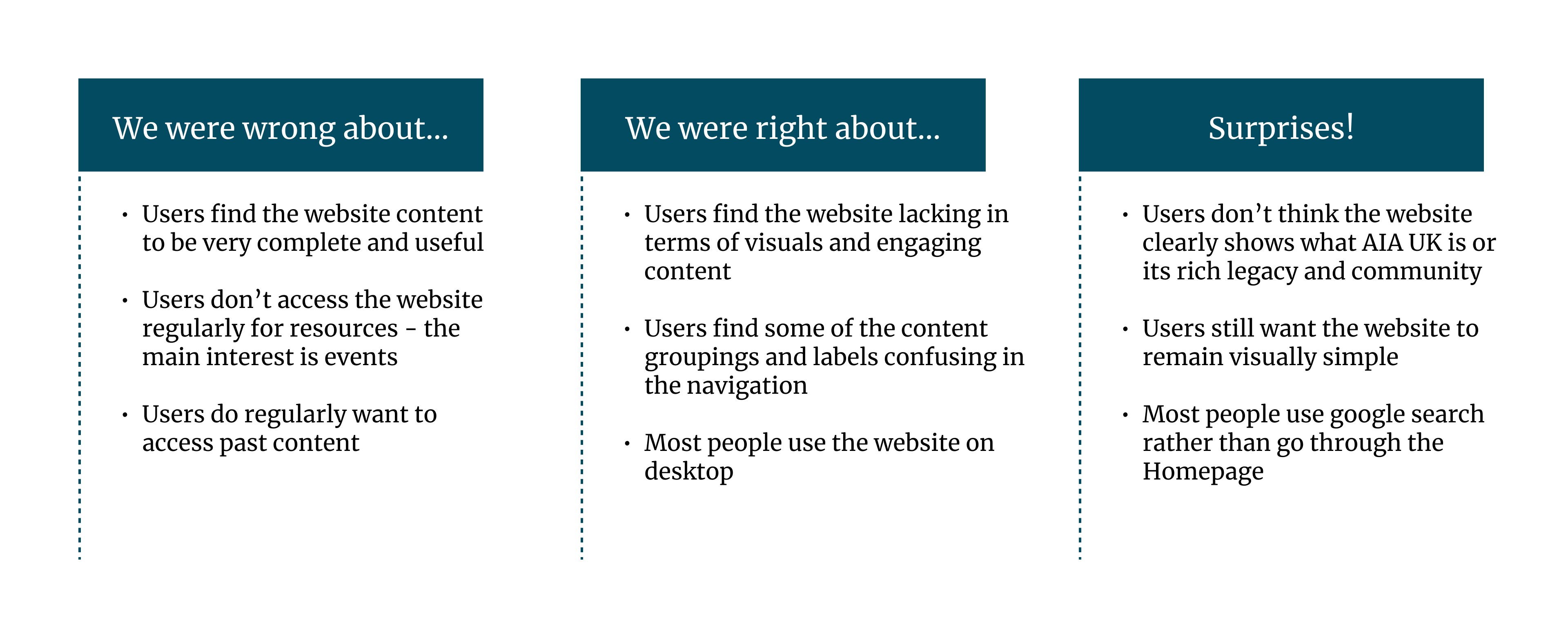
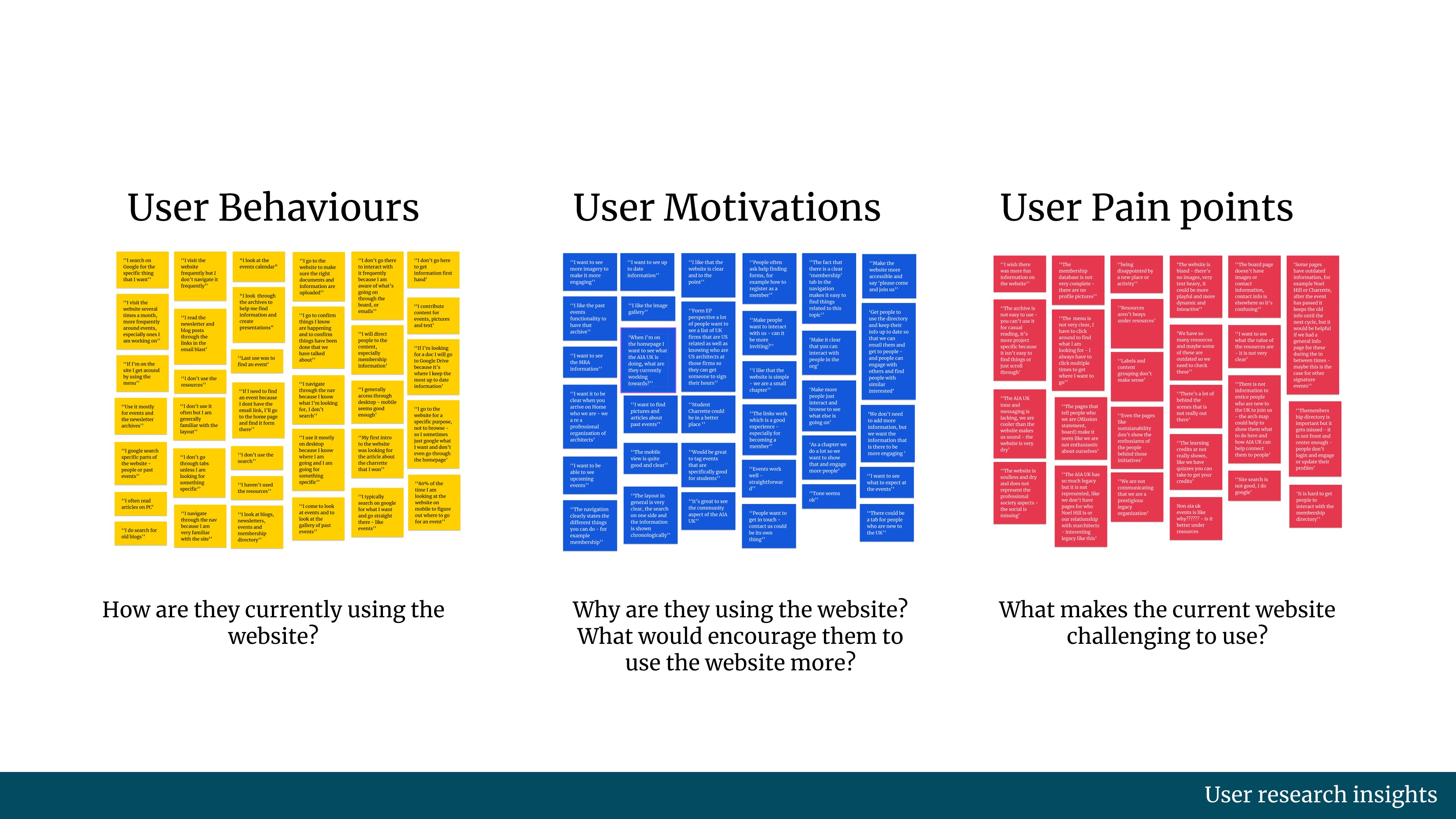
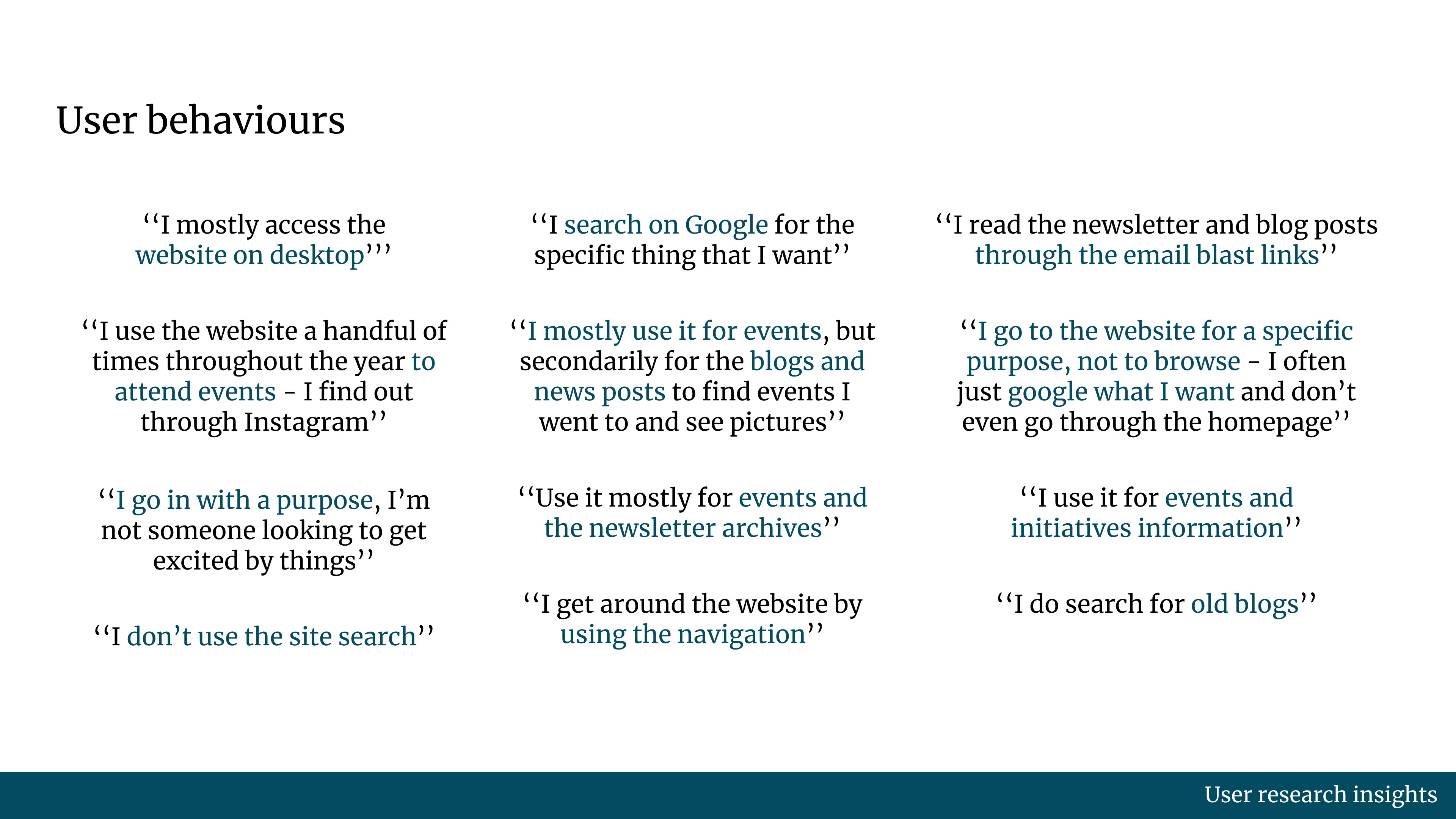
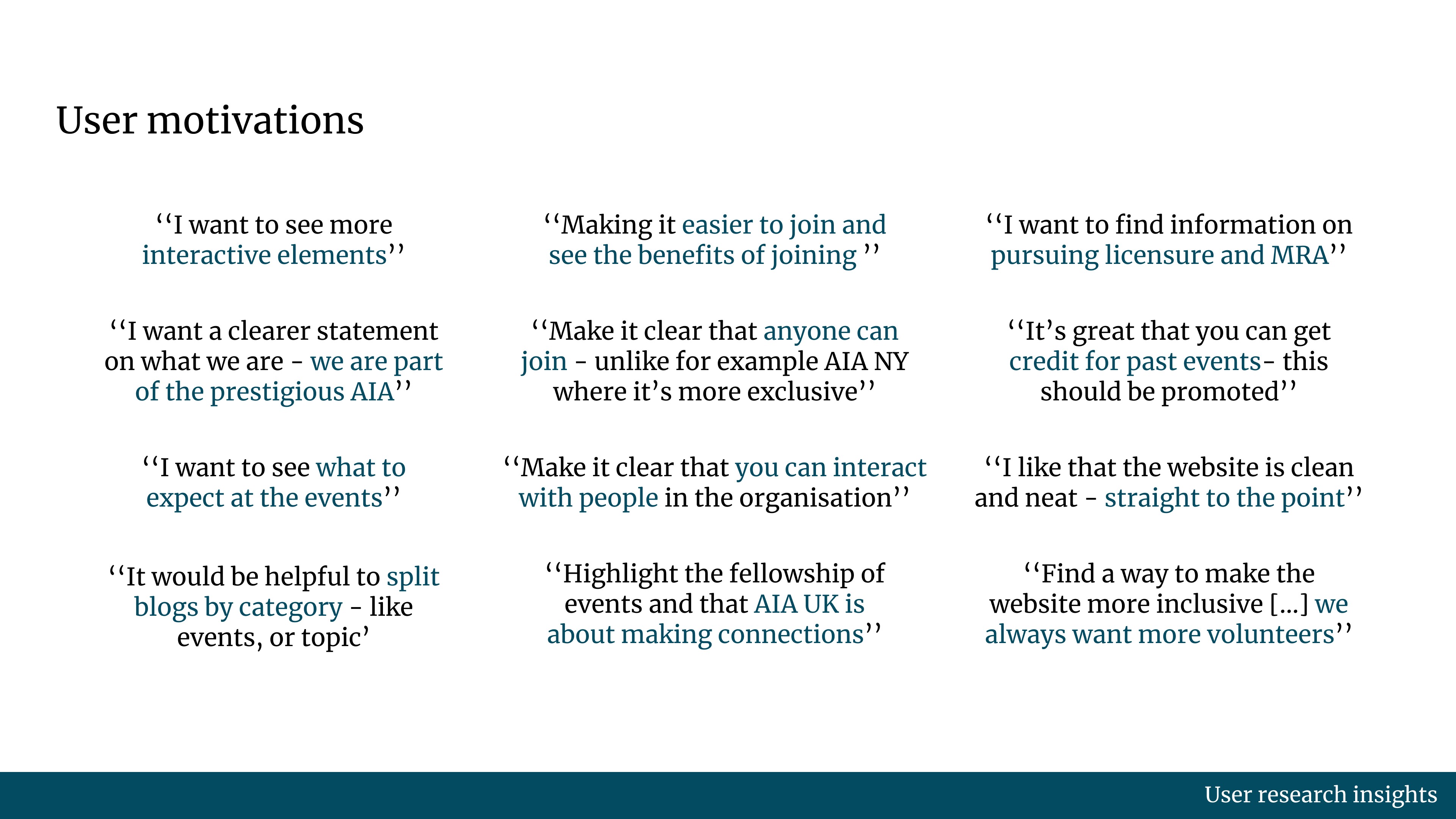
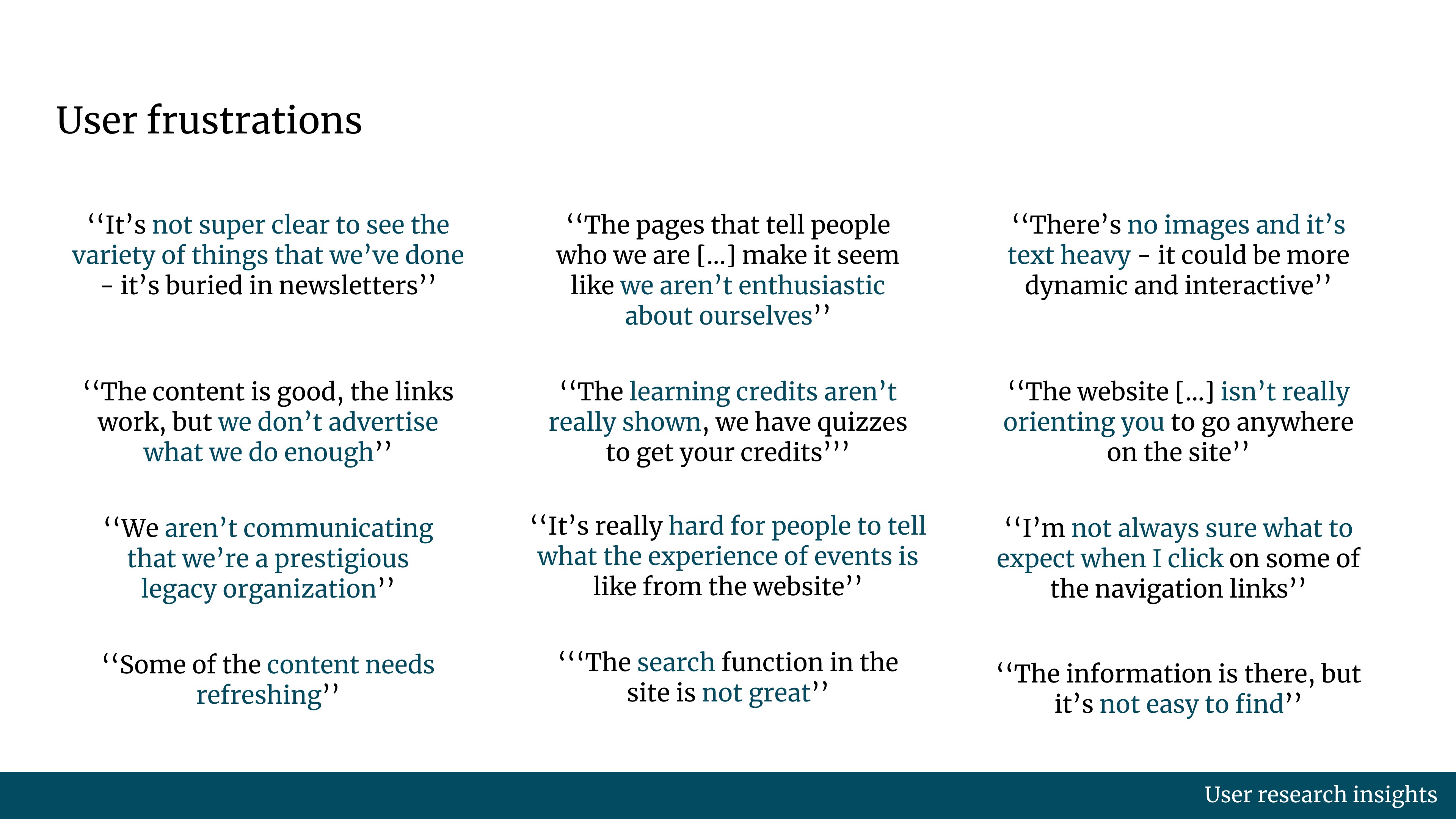
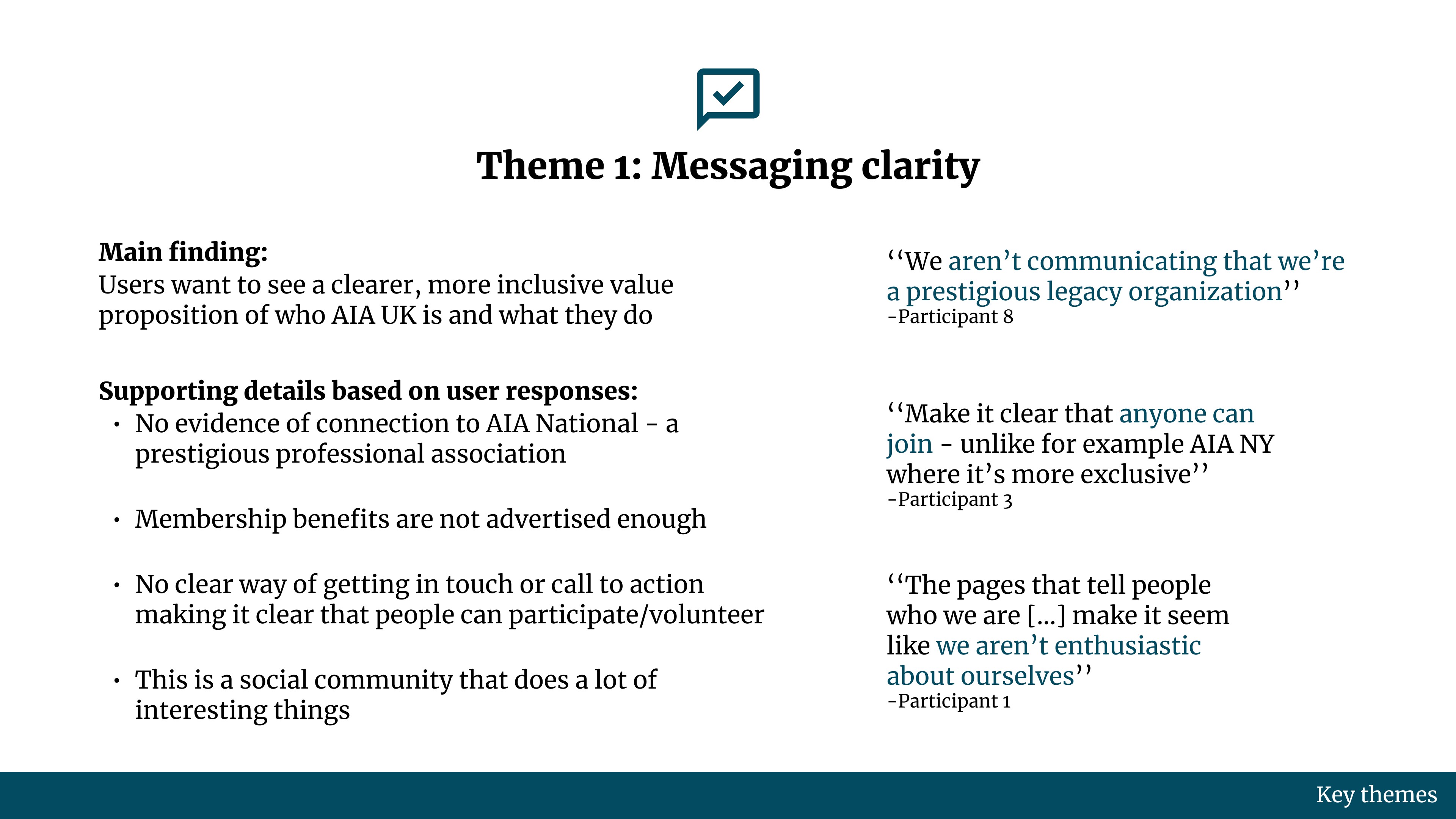
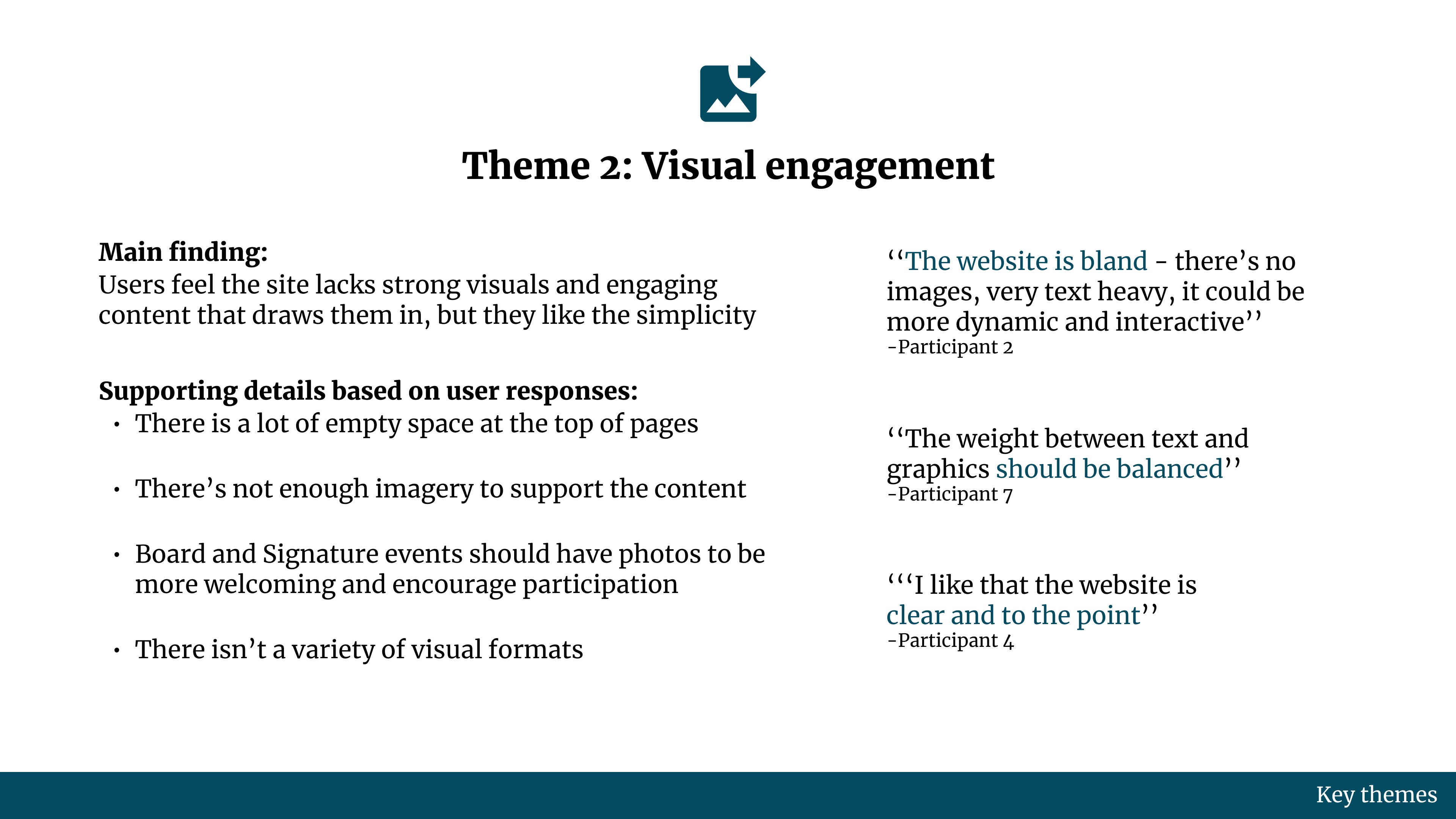
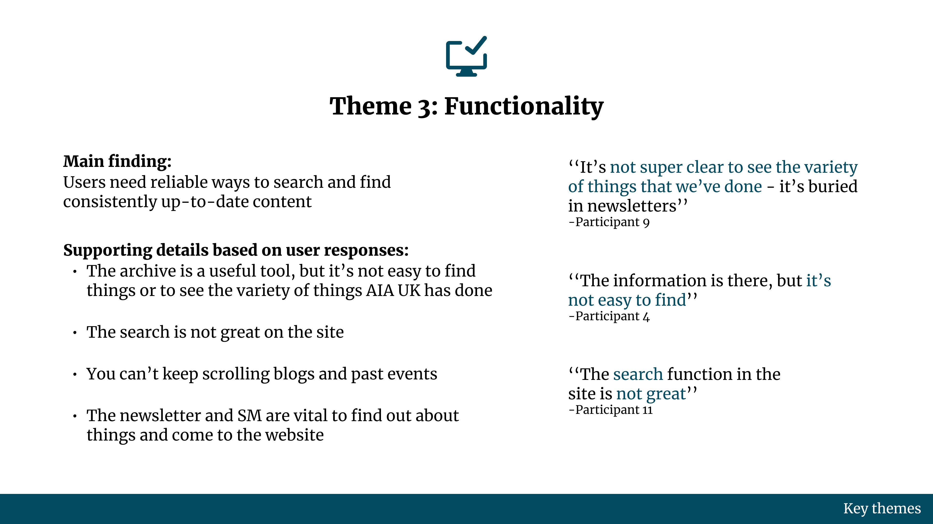
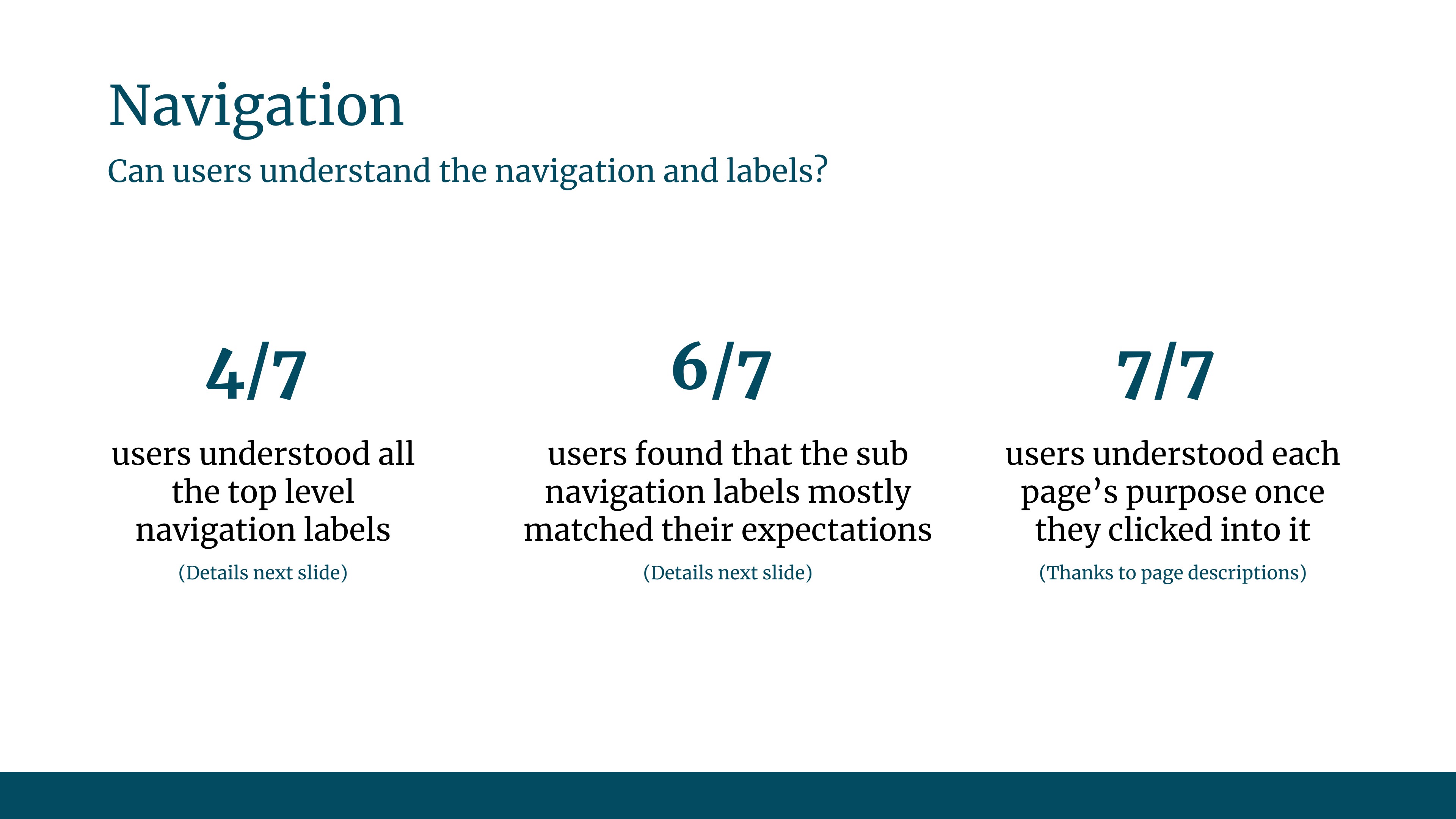
After the website audit, I set out to speak to users and understand their experience with the current AIA UK website and to understand where it is lacking. This too was presented to leadership as a way to prove the need to even embark on this project and to frame the redesign's direction and justify the design rationale presented during Phase 2.
Research Overview
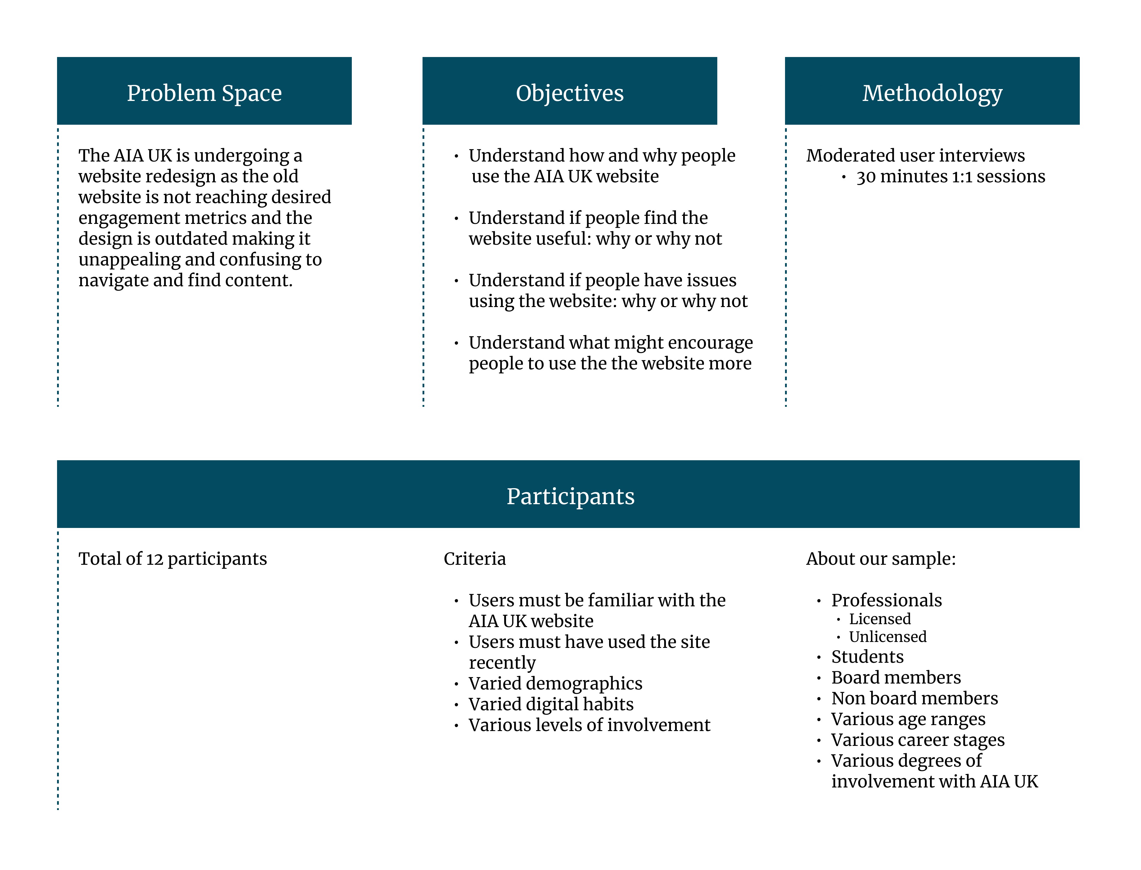
Research Insights Summary
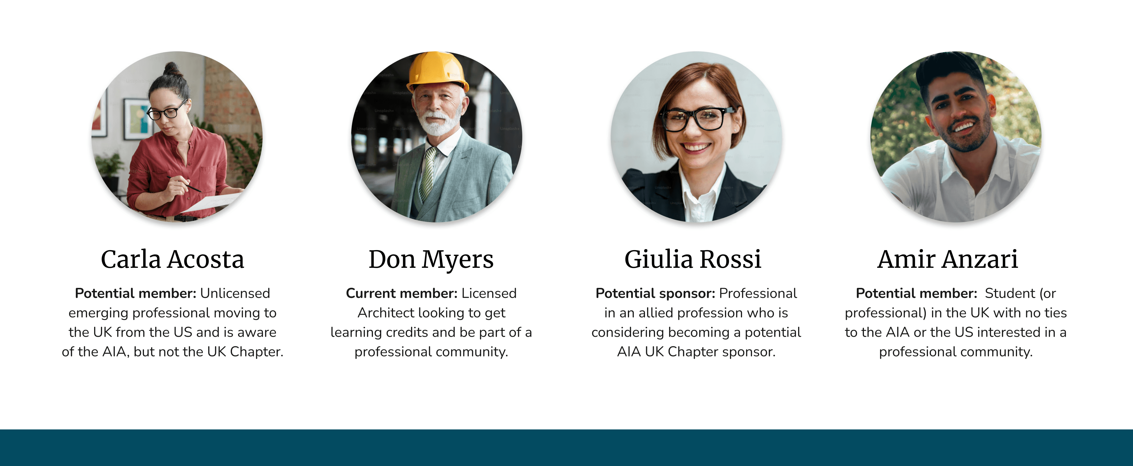
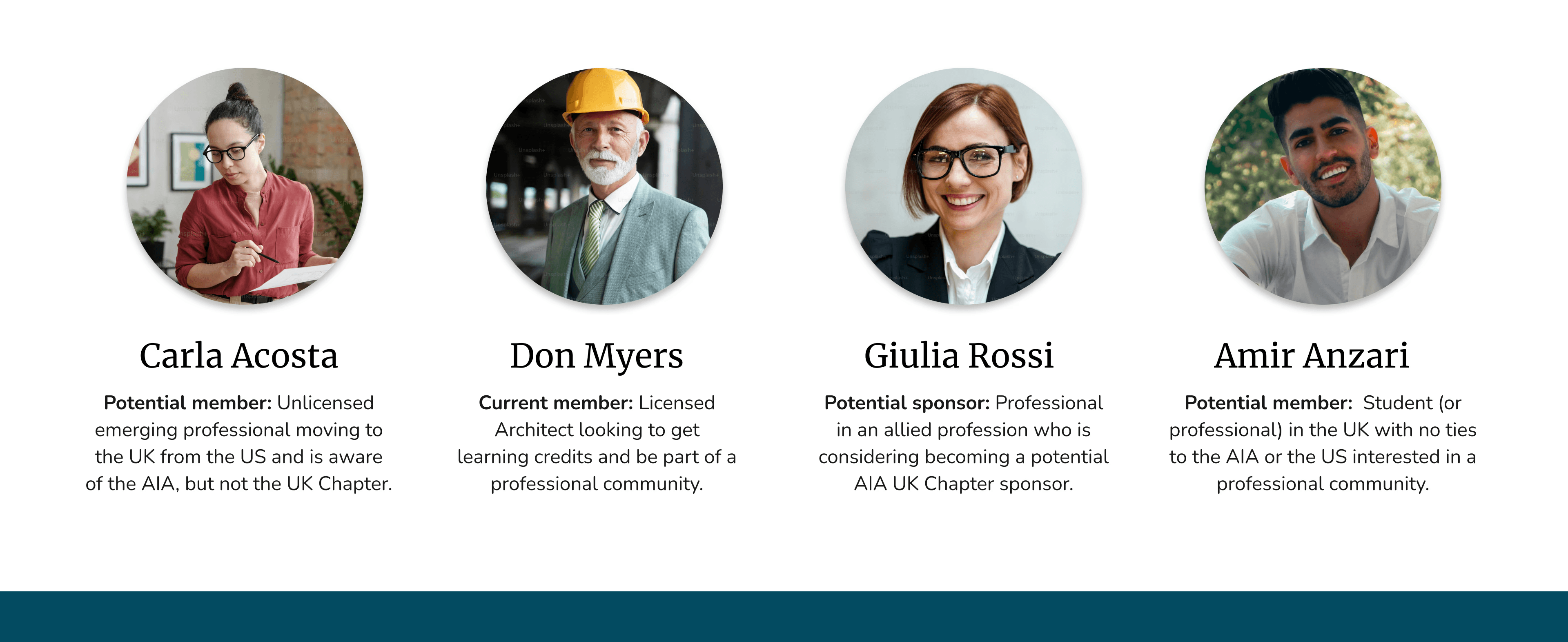
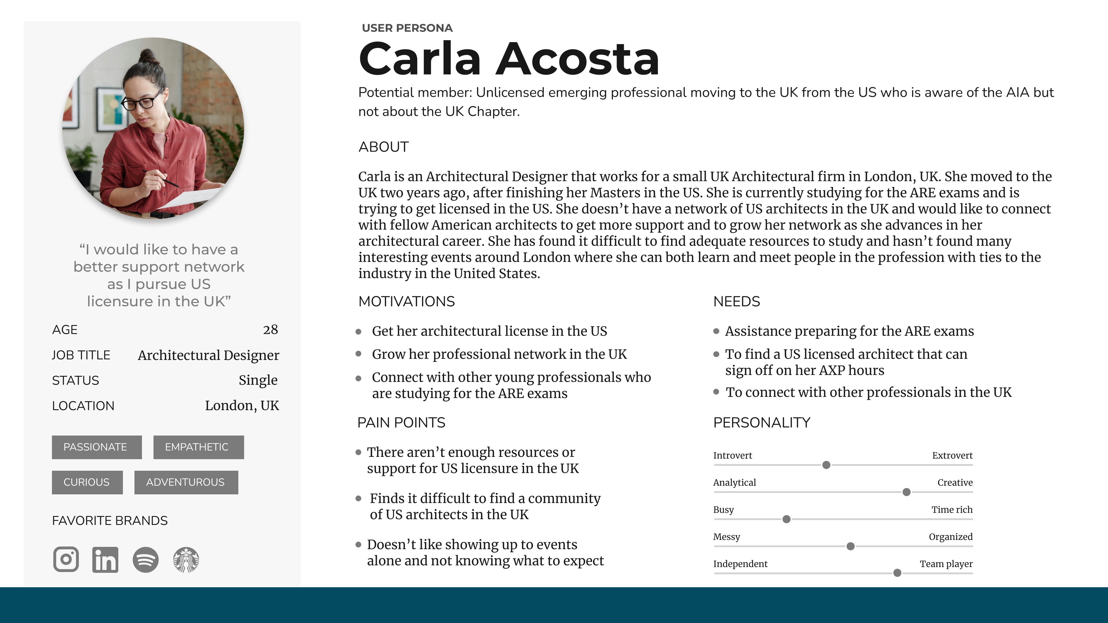
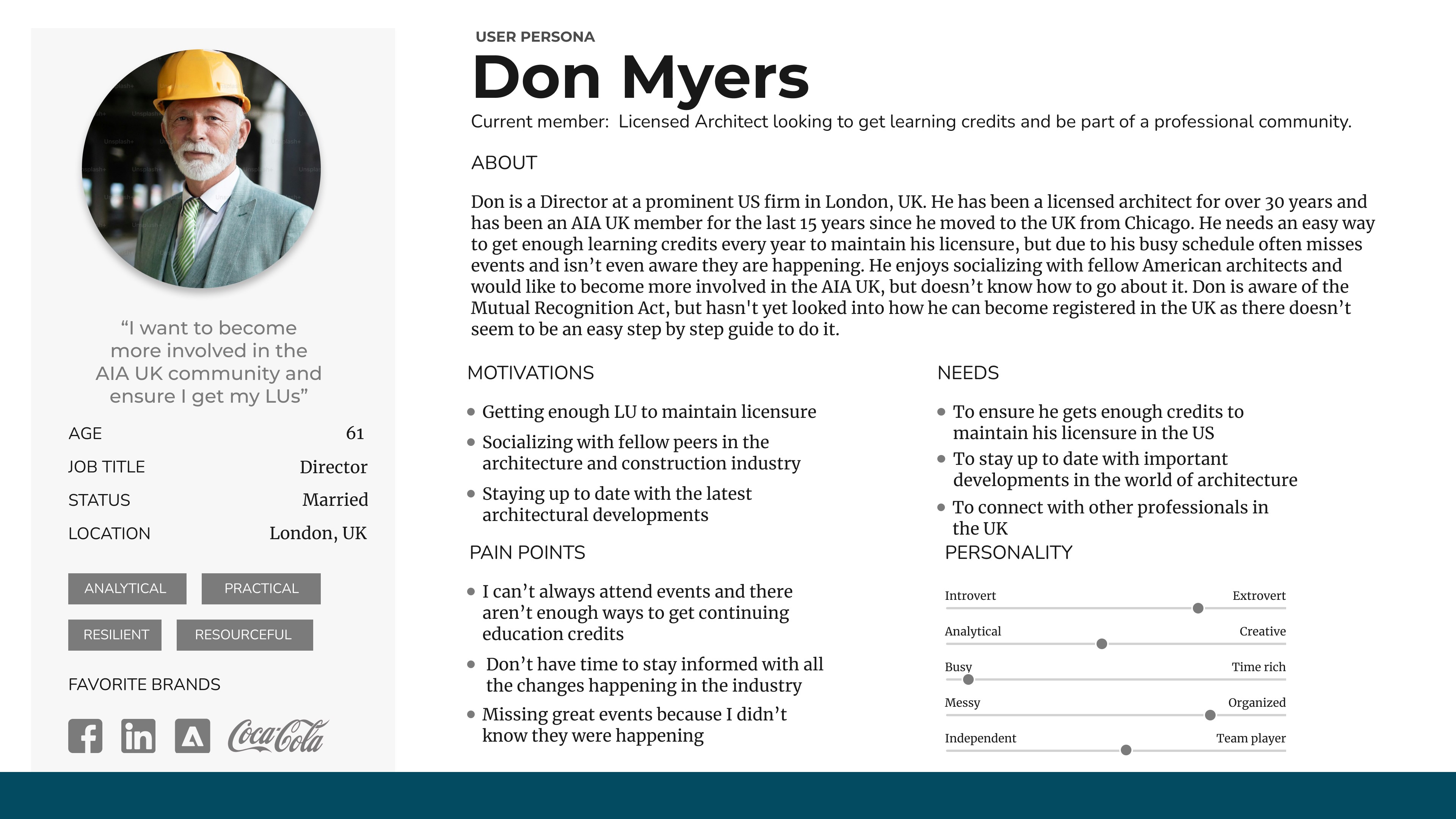
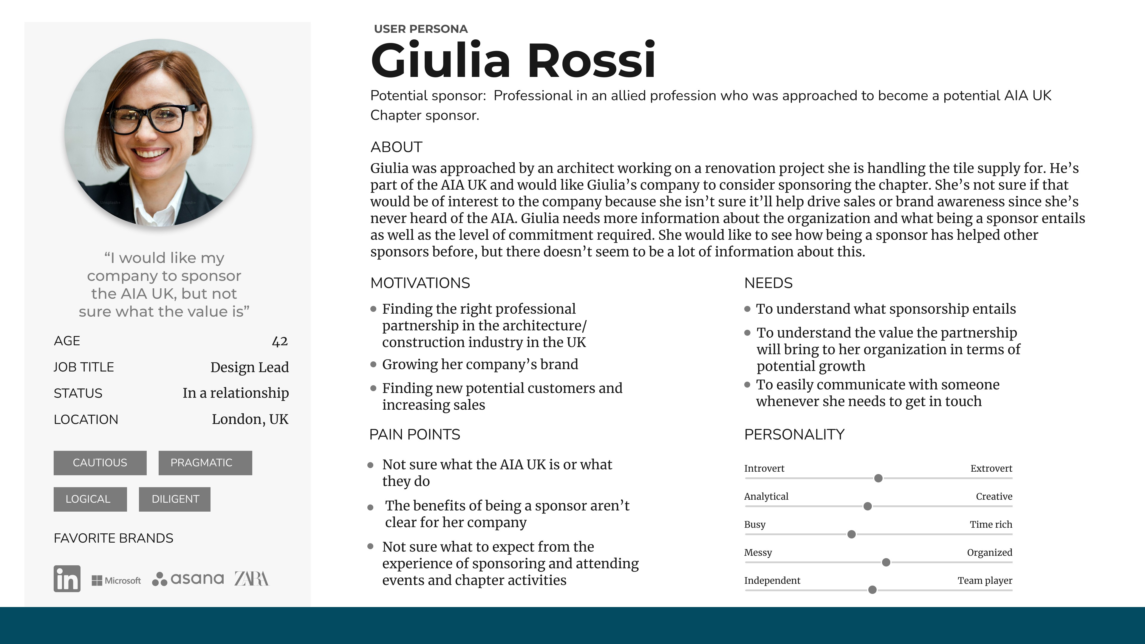
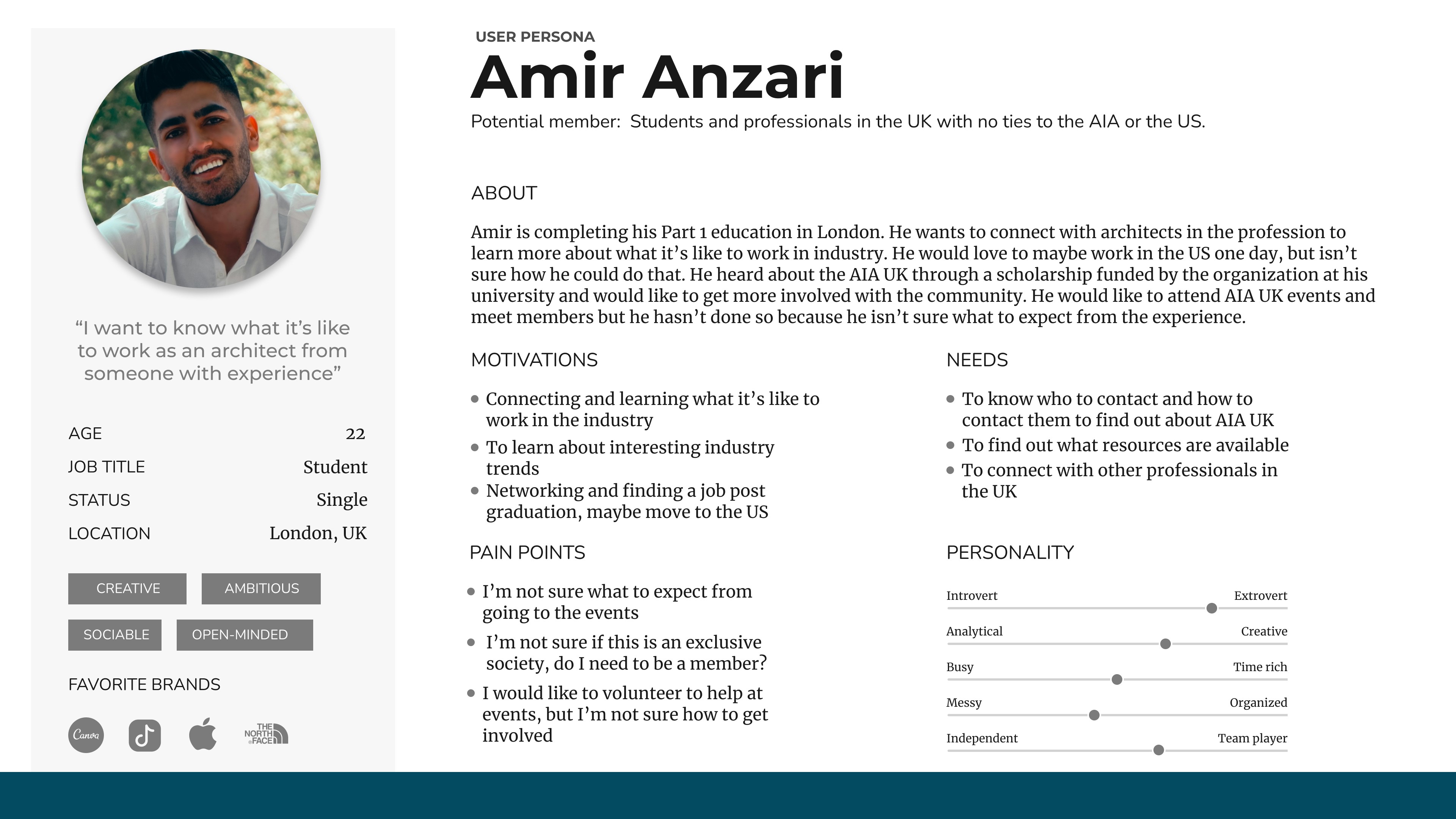
Persona Developmemt - Understanding Typical Users
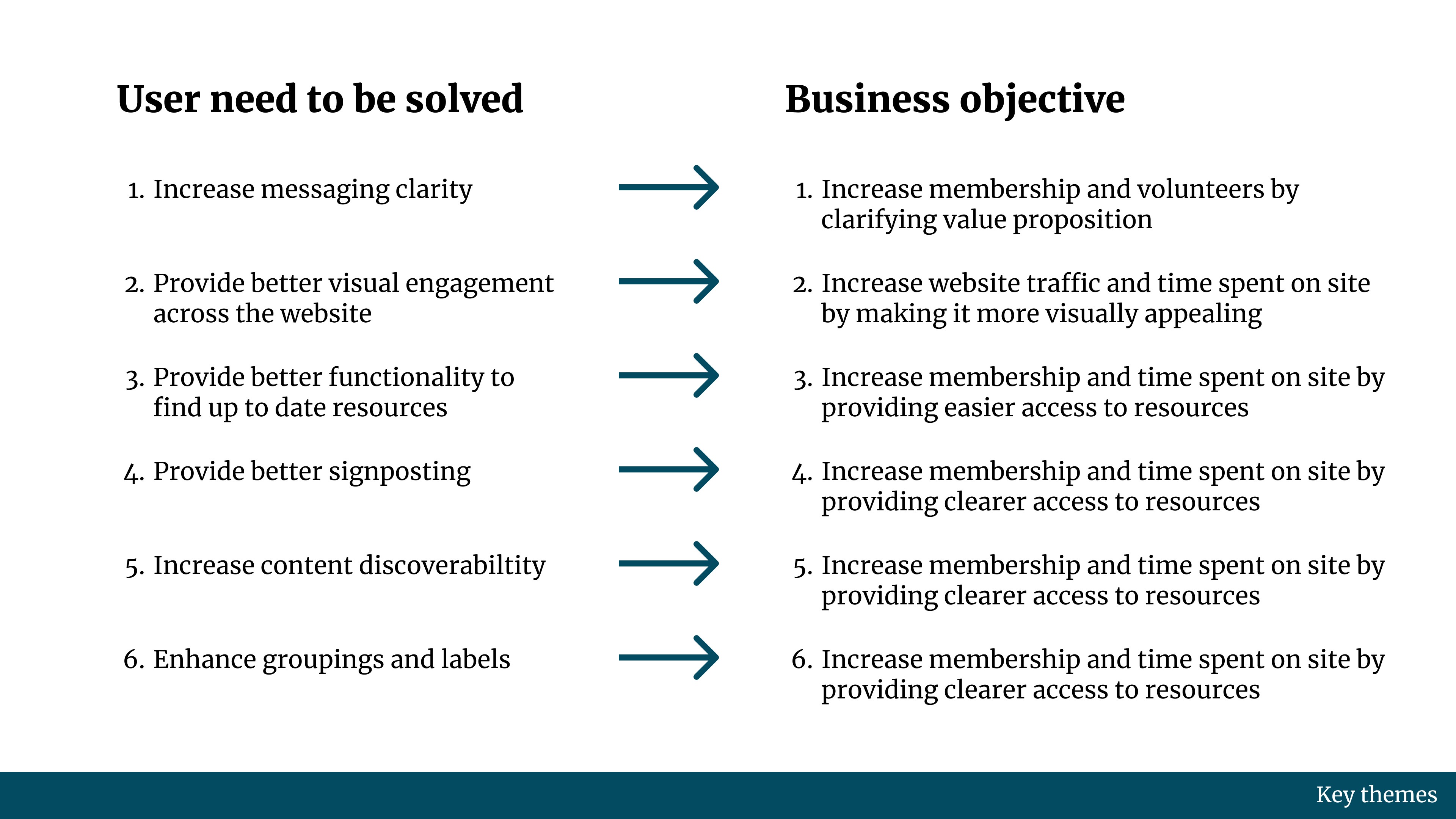
Aligning user needs with business goals
After completing the audit and the user research, the critical outcome of this phase was to paint a clear picture for stakeholders as to how what I found during the research phase was going to guide me in redesigning the website in a way that would achieve the AIA UK's business goals. I needed to show stakeholders that by addressing user needs, I would be able to acive their goals.
Phase 2
Design Development
Iteration 1 of the website redesign used one of the secondary colors of the AIA palette according to stakeholder comments saying they wanted to experiement beyond the main Black/White/Red colors. However, after this point, stakeholders decided to stick to the main Black, White and Red color scheme.
From Iteration 2 to 3, the tweaks were more minor, including aesthetic reconfigurations and alignment issues. Below is a detailed comparison of the evolution of the Homepage. To see the full, detailed evolution of all screens, please click HERE.

Phase 3
Key Stats on Redesign
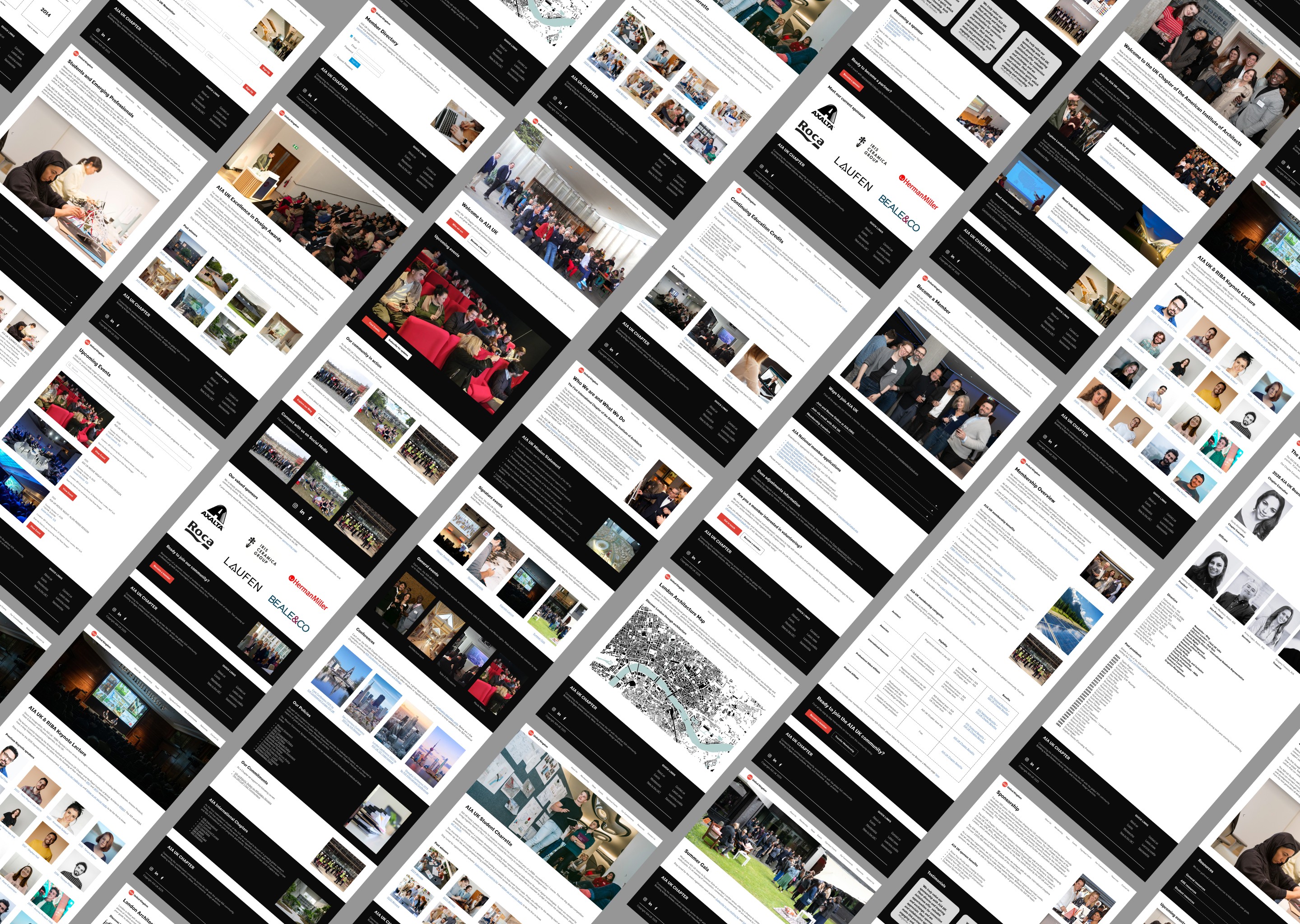
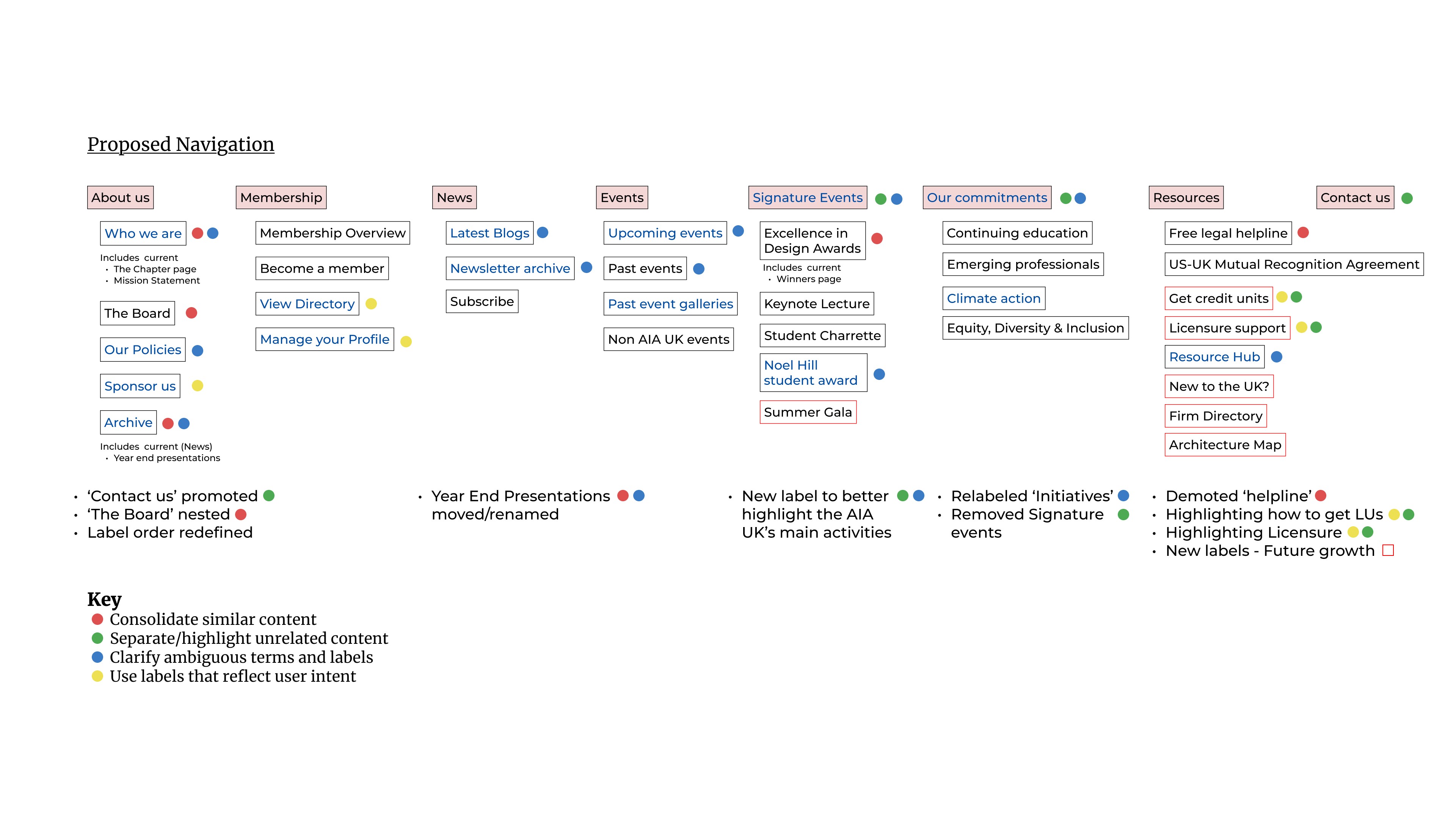
The redesign required a complete rethinking of the UX strategy of the website in order to prioritize the organization's goals. Based on the research and audit, the final page count was 30 permanent pages and 5 page templates for seasonal events. Content was redistributed in a way that made more sense to users and which suported the AIA UK's growth goals.
Technical Implementation
After Phase 2, I moved onto actually building the website in SquareSpace. Based on my recommendation to move on from the current template and template usage all together, I started the task by developing the Styles and building blocks of the new website. I then built all pages and copied the rich legacy of the AIA UK's newsletter and blog archives to ensure nothing was lost.
During this phase I also had the opportunity to sharpen and grow my HTML and CSS skills as the current SquareSpace platfrom presented various challenges and limitations as to what you can do with the design using out of the box capabilities.
Thankfully, there is a way to code various aspects of the website yourself in order to give the designer creativity and flexibility over the way the website looks and functions.
Styles & Layout Guideline Setting
I set up the SquareSpace styles and also developed the layout and grid settings, in addition to the creating resuable sections and page templates to faciliatate building more pages and content in the future. Below are some expamples of what was defined and set up:
Custom Code Solutions
The out of the box solutions for SquareSpace left a lot to be desired, especially in terms of the mobile view of the website. I was determined to code solutions and surpass the limiations presented by the platform. Below are a few examples of the custom code solutions I developed to enhance the user experience of the AIA UK website,
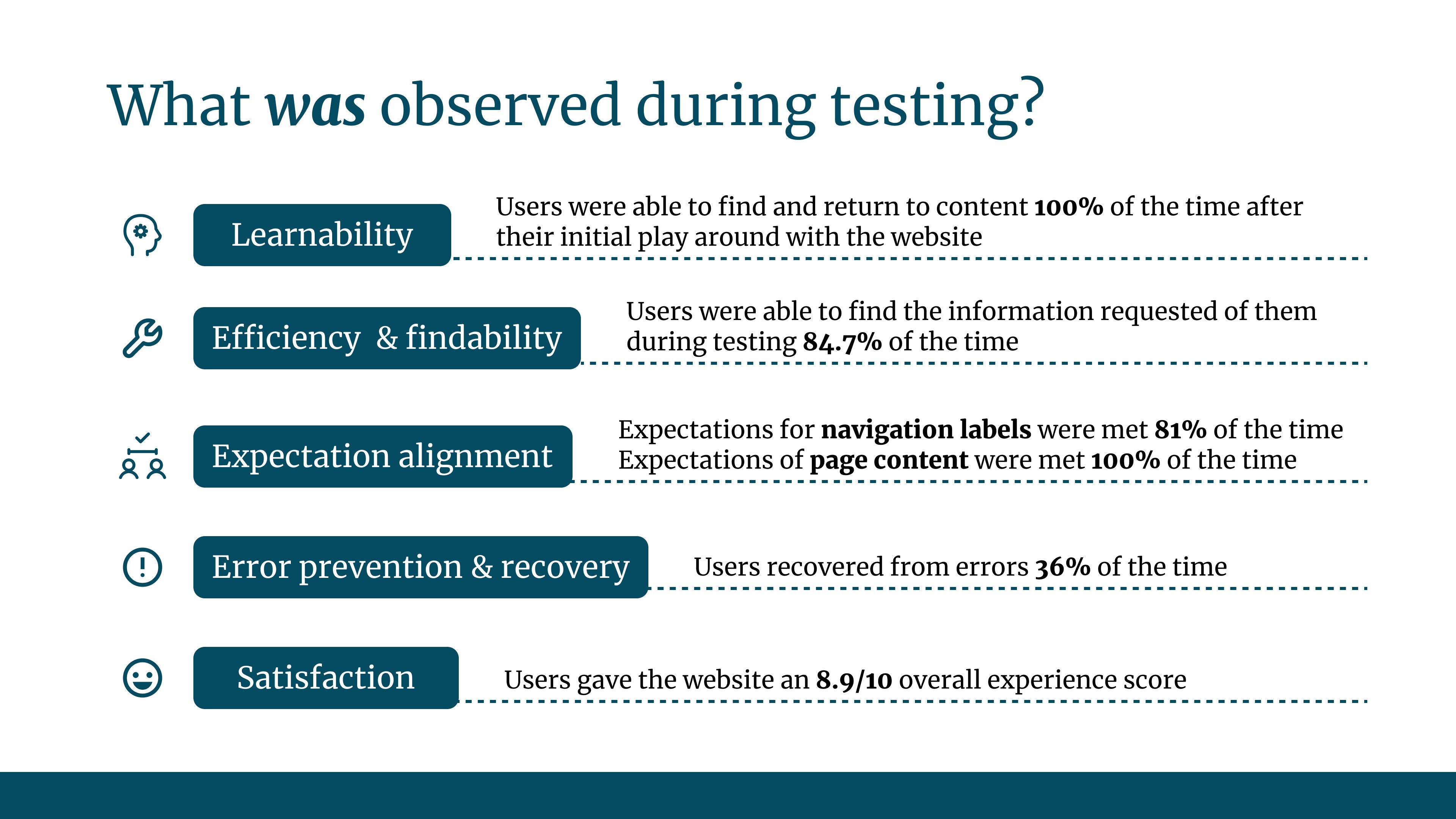
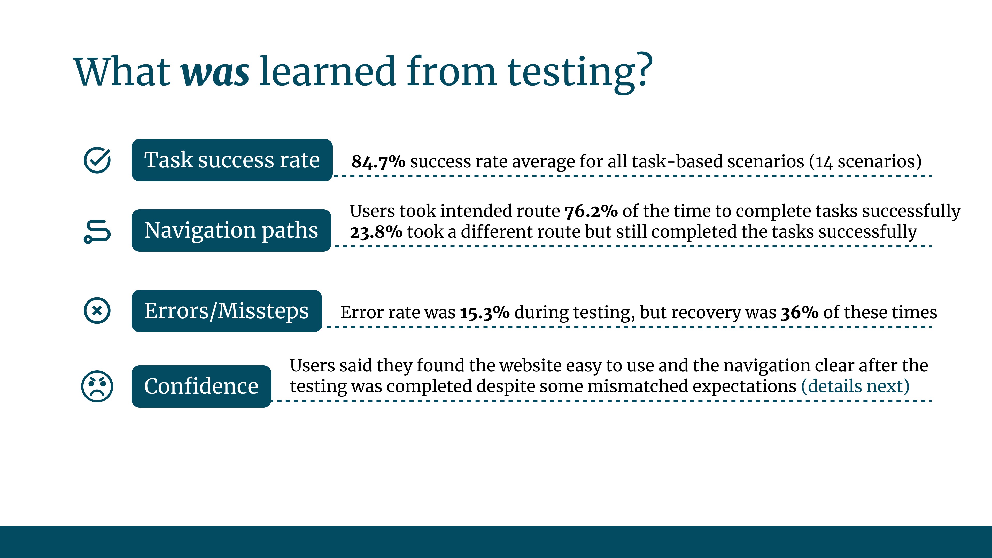
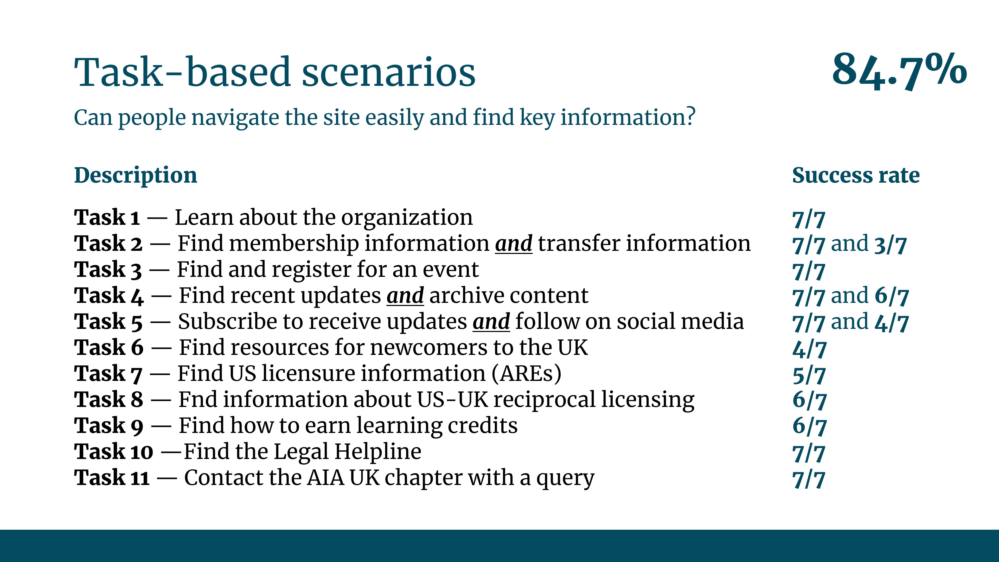
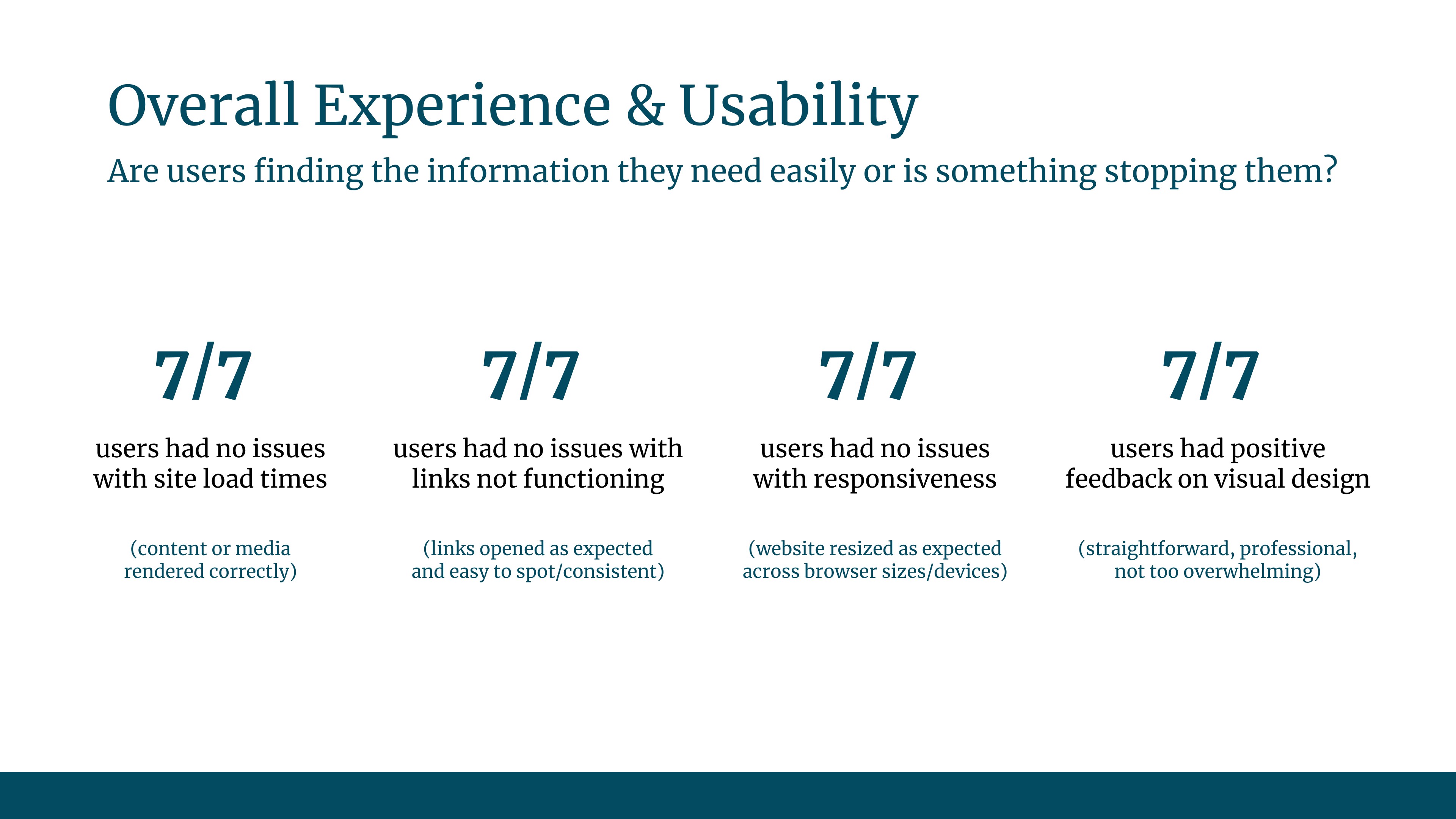
Usability Testing & Final Design
Once the website was built and I had optimized the responsiveness across devices, I moved onto the testing phase. Due to cost and time constraints, this was limited to one round of usability testing. However, the testing proved invaluable to the final design and I was able to discover and work through varous kinks presented in the functionality and design of the website across devices.
Phase 4
Documentation & Handover
After completing the website, I also factored in a phase during which I would handover the website to the AIA UK's administrator and website team. I created documentation and led training workshops to explain how to use and maintain the website from the backend. This was helpful to ensure the final product aligned with stakeholder goals and met their needs in terms of future maintenance and management.
Key aspects of the training included:
Results
Launch
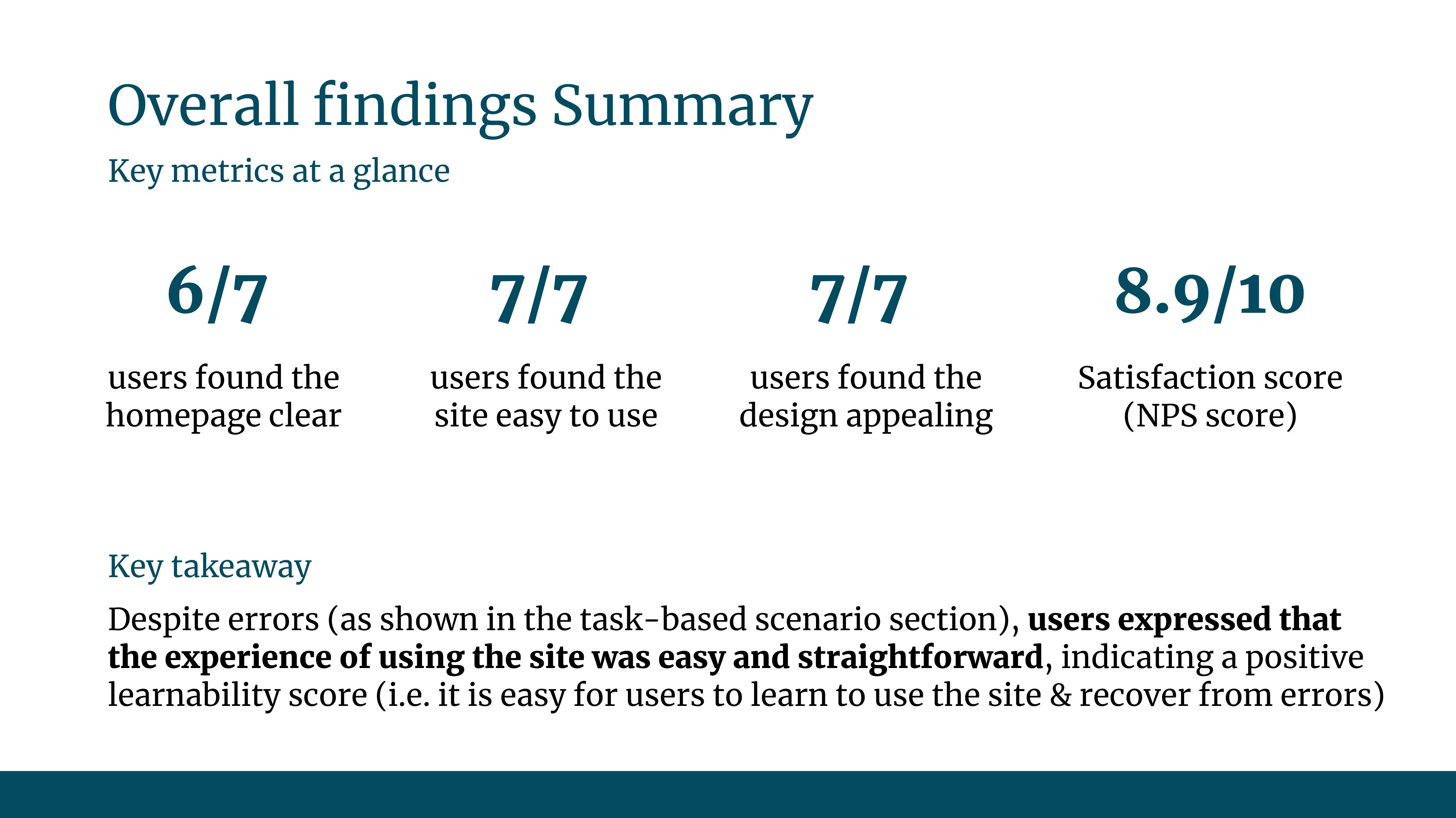
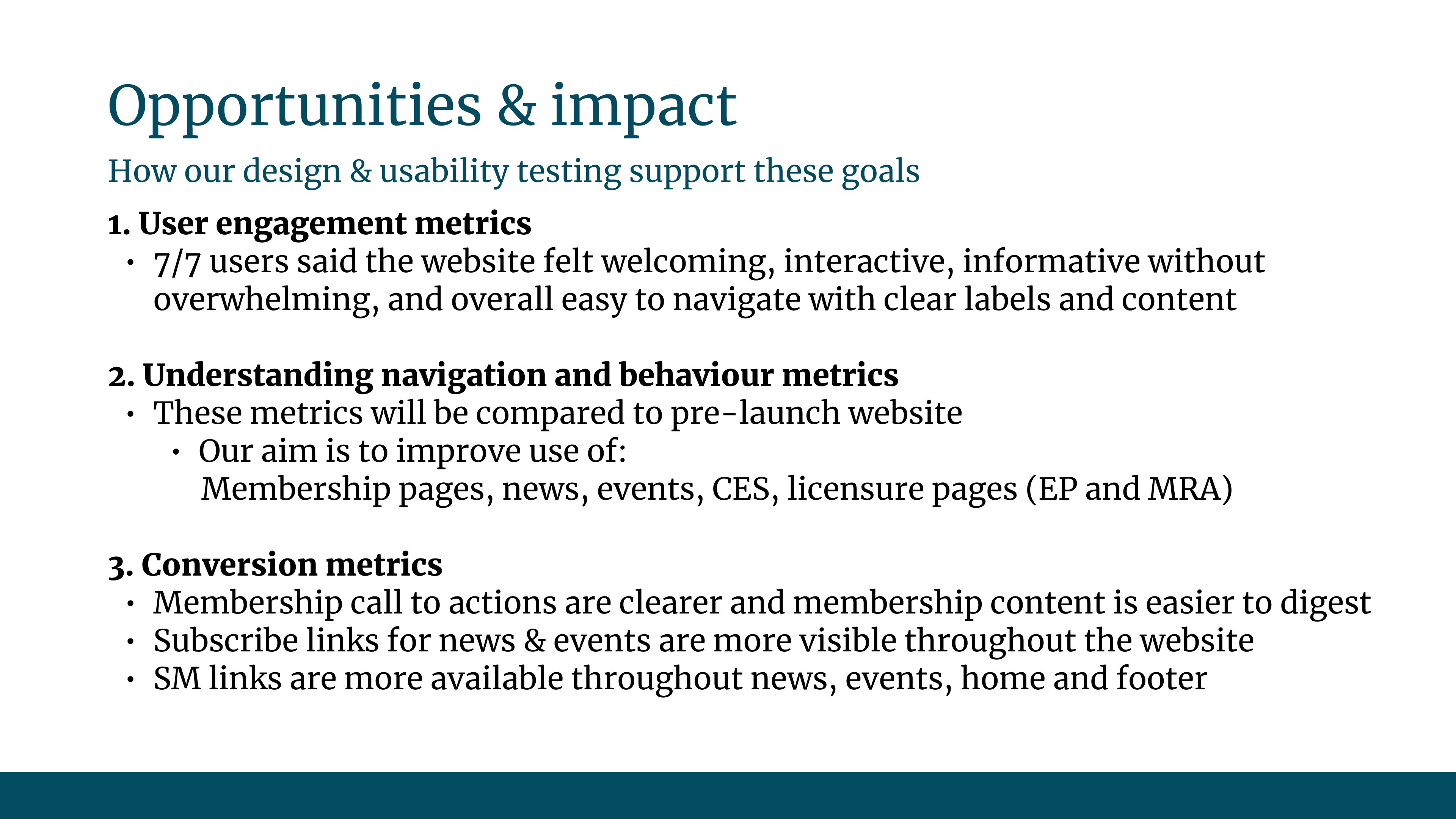
The website launched on December 12th, 2026. Four and a half months after the project launched. We launched during the AIA UK's quietest time of the year to ensure all usability issues could be ironed out should any arise. Board members were the first to test it, resulting in overwhelmingly positive reviews. The website was ready in time for the AIA UK's certification review by AIA National (AIA UK's parent organization) in January 2026. The new website proved useful to keep its status as an AIA Chapter. The website showed a clearer value proposition and made it easier for new and existing members to take full advanagte of the AIA's resources in the UK.
After reviewing the webiste's analytics 3 months after launch, we identified two clear areas of improvement:
Increasing Conversion Rates
The new design proved beneficial to the growth goals set out at the beginning of the project as seen by the improvements in the metrics we set out to measure in the new website compared to the old site. Below are metrics taken over the 8 weeks prior to launch vs 8 weeks post launch:
We saw an increase in event mailing list subscriptions rise from 25% up to 88.9%
We saw an increase in newsletter mailing list subscriptions rise from 0.3% up to 11.1%
We saw an increase in users getting in touch rise from 2.7% up to 15.6%
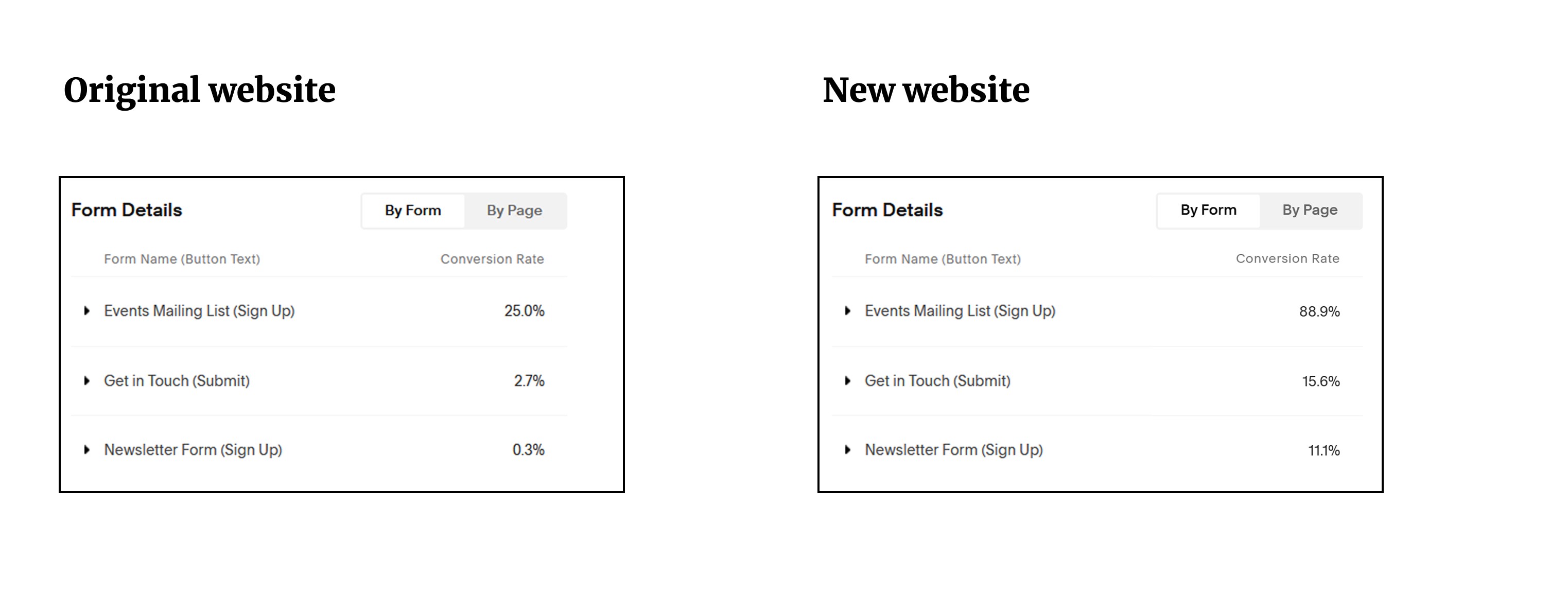
The significance of these metrics is that the webiste is encouraging more people to want to attend events, engage with the organization and eventually become members - the AIA UK's overall goal.
Increasing Website Traffic
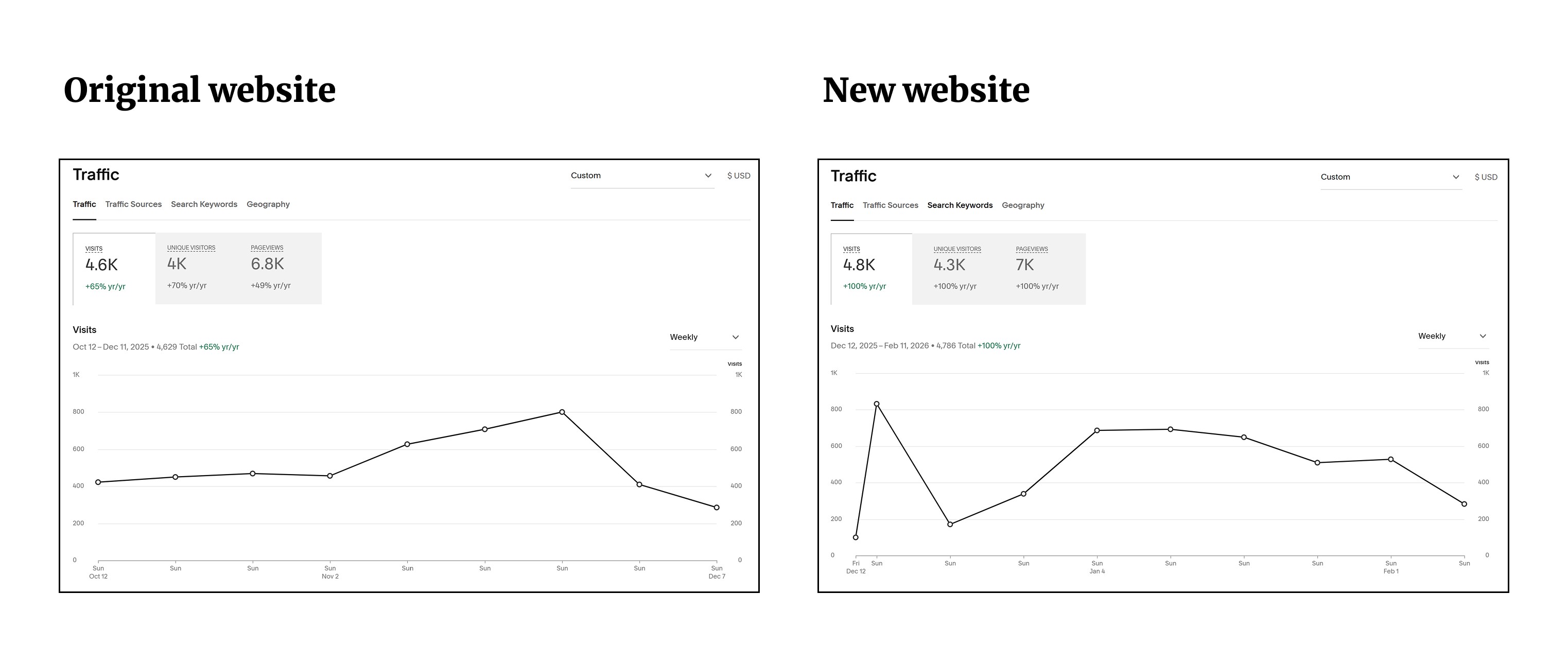
In addition to the growth impact caused by the improved design, all the work I carried out with SEO improvements also proved helpful in driving traffic to the website and across pages once users arrived to the site. Note that the numbers may not seem grand, but we did go live during the quiet Christmas season.
We saw an increase in traffic by 4.35%
We saw an increase in unique views by 7.5%
Challenges & Learnings
Feasibility Management
Working with a no-code/low-code platform was a great experience to develop my coding skills and work through technical constraints in a way that I had not had to do before. Given my background as a UX Designer who had always to this point worked with engineering teams that were responsible for the actual design implementation, I had always depended on someone else to bring up feasibility issues during the early stages of design. This time, any feasibility issue was up to me to solve. I had to do a lot of testing and research even before iteration 1 to ensure I was not overpromising to the AIA UK stakeholders.
Stakeholder Management
In my role as a UX Consultant, I had managed stakeholders before, but I was not in charge of the relationship from 0-1. This project gave me the opportunity to do so and learn to better balance the requirements of stakeholders with those of the users.
Project Management
This opportunity also allowed me to truly fully oversee and manage the 0-1 delivery of a digital product as my role extended beyond the design portions of a project. I had the opportunity to completely oversee the project planning and product development. I had to deal with issues of scope creep and ensuring the project progressed to each phase in a timely manner.
Other Projects